
This is how I’ve done my second draft, I made it more in the newspaper style with the columns, and I tried to use all the space to include as much information as I can. I think I can still resize and rearrange the pieces to fit a bit better. Please give any feedback.

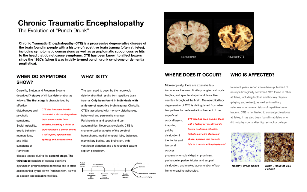
I like the draft overall! I think the first thing that jumped at me though is that the images at the top with the normal brain and advanced CTE are not particularly contextualized for me as the viewer. Maybe add a small description of why that image is important and what it says to create a clear connection for the audience between your topic and the image. Additionally, I personally feel a bit distracted with the red font paragraph in the middle of each of the descriptions mostly because it seems to be the entry point of the text just because it is so contrasting to the overall design so I am not sure if that was the intention? I also love in the title “The Evolution of the Punch Drunk” and I think it is very engaging but makes me curious about what the drunk punch is? What that feels like? Maybe adding a sentence something like “Imagine feeling…” and basically describe the feeling of punch drunk and how surprising the sensations are associated with the condition in the first sentence of the subsection after the title so that it connects the clever title with a directly related idea that further explains that feeling of punch drunk. In terms of design elements, I love the flow, the hierarchy, and high contrast environment that keeps good amounts of white space and margins as to let me breathe mentally. Let me know if have any questions!!
LikeLike
Hi Tola,
This is very good improvement on your previous draft. I really like how you utilized the grid because it clearly separates the different categories. I noticed a few things that can make your poster a bit more engaging to viewers who are unfamiliar with the topic. If there is any way to make the title a little more catchy or engaging, I think that would make the poster less scary, because at first glance I have no idea what the information covers by looking at the title (encephalopathy is a big word that might scare the audience away). I can clearly see the different levels which is great, and the information in each section is very clear. Perhaps focusing on making it more visually appealing and easy on the eyes is something you can work on for your final draft. For example, in your first section “When do symptoms show?” , maybe you could create 3 sublevels/subsections instead of just bolding “the first stage” etc. so it breaks up that text into three more easily digestible chunks. (Also, a note for that section: I don’t really know when I’m supposed to read the red text, maybe putting it into a “Did you know?” box could help? I don’t know if it’s supposed to be in that first section or or the third section either since it is repeated so that’s just one thing to watch out for). For the second and third sections, there are a lot of complex terms that could be more understandable if you had schematics (ie of a brain with arrows pointing to the different parts). The bottom timescale graphic also appears to be tied to this section instead of the first one because of how you made the different sections into columns (maybe you can had an arrow pointing to the graph from the first section?). Other than these things I think you made a really clear information poster with a good flow that explains the topic well!!
LikeLike