Hi Phoebe! This is a good upgrade from the first and second draft, and I can see that you’ve changed a lot. I like how you included the section on the right, which was very interesting to read. I like that you added more visuals and like the simple color scheme. There is a clear entry point and grid system. One thing I would point out is the size of the font on the right section, in which it may be a little hard to distinguish the levels of hierarchy. Maybe making the subtitles larger would help. Other than that, well done!
Sorry for the late comment.
I think this draft is a big change from your first and second drafts. The color differences clearly distinguish each information level. I think using blue and red is a good choice because it matches the graphics. The entry point is clear to me as well. The red title on blue background really pops up. The lines also divide each section of the page effectively. One change I would make is to be consistent with color use. IE: On the right side, change the color of the question “What’s the difference?” to red and the answer below to blue.
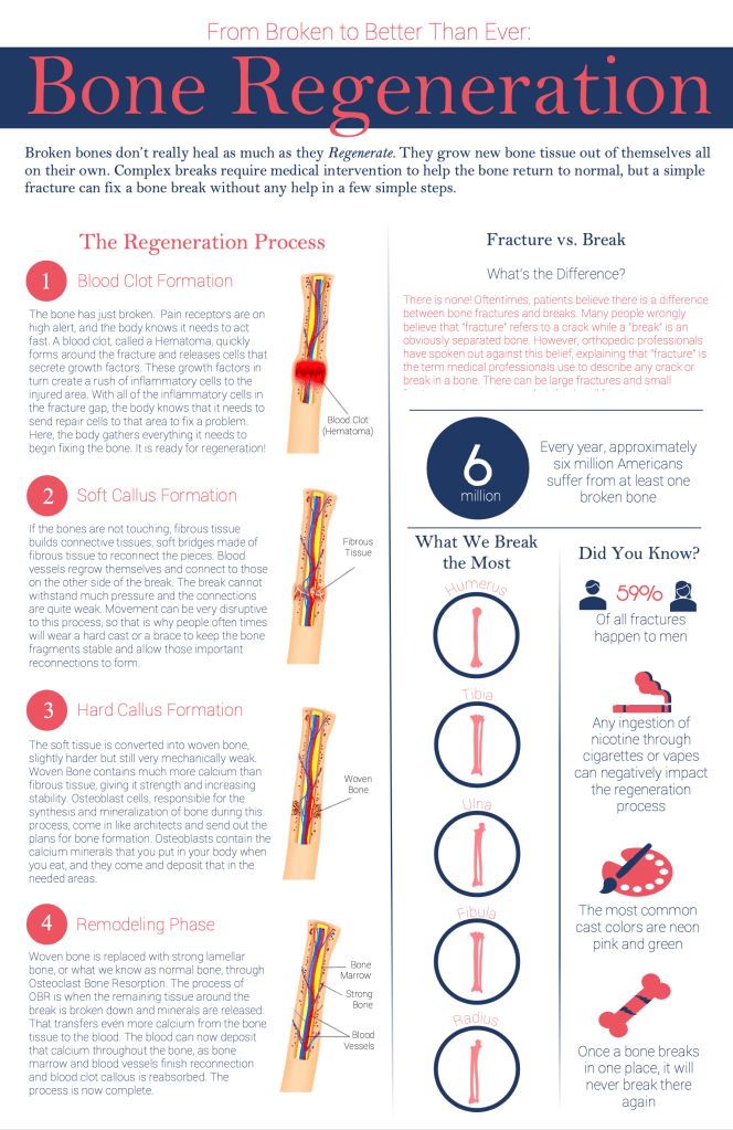


Hi Phoebe! This is a good upgrade from the first and second draft, and I can see that you’ve changed a lot. I like how you included the section on the right, which was very interesting to read. I like that you added more visuals and like the simple color scheme. There is a clear entry point and grid system. One thing I would point out is the size of the font on the right section, in which it may be a little hard to distinguish the levels of hierarchy. Maybe making the subtitles larger would help. Other than that, well done!
LikeLike
Sorry for the late comment.
I think this draft is a big change from your first and second drafts. The color differences clearly distinguish each information level. I think using blue and red is a good choice because it matches the graphics. The entry point is clear to me as well. The red title on blue background really pops up. The lines also divide each section of the page effectively. One change I would make is to be consistent with color use. IE: On the right side, change the color of the question “What’s the difference?” to red and the answer below to blue.
LikeLike