
For my feedback, I’d most like help knowing whether my use of white space is more effective here, whether pictures and text are still competing, and whether the timeline is clear. Do you know where to start and end? Also, I have two drafts, one with multiple colors for my timeline vs. one with a grayscale–which is more effective/less distracting?

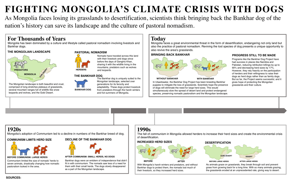

I like these a lot! I definitely think the change in timeline style makes it much easier to follow. The beginning and end is clear to me. In terms of the timeline color variation, the second one is less distracting, but honestly you could also go with the first one too because since it matches the color scheme it’s not like it’s crazy distracting either! I would say your preference, but the second one is definitely more muted and let me put my attention straight on the boxes.
In regards to your use of white space, I think it’s good! I would just say that I know things are tight because there’s a good amount of information, but if there’s any way to give the tiniest more margin space on the edge of the boxes, that might help give things a bit more breathing room (I’m looking at the left edges of each box in particular). Also if there is any space to spare to make a little gap between the title of each box and the text that would be nice too.
The pictures are so cute!! I really think they are very helpful for understanding exactly what’s going on, especially to show desertification. It didn’t occur to me that the images are competing with the text, but I do I think it would be nice if they were a bit bigger, but again I know that’s hard because things are tight.
Other than that I think it’s very easy to read and clear! Excited to see the final draft!
LikeLike
I really like this edit, I feel like it is much more balanced overall with the white spaces that let the eye to breathe. In my view, the pictures and text are no longer competing but rather complement each other within the given context. Between the two drafts, I feel like the second one with the gray theme is a lot more natural and aesthetic. As well as less distracting to the overall view. I also love the timeline structure as it outlines a clear order and logical progression.
LikeLike