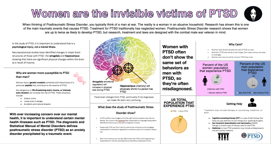
Hi Hannah! You’ve done a great job and made big improvements since the first draft. I like the brain image in the middle, which really caught my attention. I can see a clear grid system and the flow information was easy to follow and interesting to read. One thing to point out is the leading, which for example, there is a large gap between the lines in the subtitle ” What does the study of Post traumatic stress disorder show,” while there is smaller space between lines in other sections. In that section, the font also seems to be smaller than the ones on the top left, so I would recommend keeping the font size more consistent. Also, in the Getting Help section, the letters and words in “treatment may include therapy…” are spaced out more, so keeping that consistent as well. Other than that, great work!
Your drafts have been getting better and better, and this one is a huge improvement from your last draft. Your title is definitely clearer, I’m glad to see you have a subtitle giving an overview of your content to follow, and I see a clear implementation of the grid. I like the addition of headers to certain sections, such as, “Why are women more susceptible to PTSD than men?” and “Why care?” and “Getting help?” It is a clear use of levels and very helpful for entering those sections. Maybe it would help to have a similar header for your section with the brain?
I think your use of white space is good, in that your visual explanation is not “overwhelming” to look at, but I think it would be helpful and maybe help in terms of organizing your content to have your margins more consistent, i.e. in your left column, having each of those columns align on the left side.
I really like the visuals you have implemented. For example, your pink and blue sections coupled with the female and male figures makes it very clear that the data you are presenting is separate, and that one piece corresponds with women, and the other with men. What would make this even better could be greater consistency in your typography, such as its spacing, and whether it is center-aligned or left-aligned, just to give your viewer a clearer way to go through and interpret your content.


Hi Hannah! You’ve done a great job and made big improvements since the first draft. I like the brain image in the middle, which really caught my attention. I can see a clear grid system and the flow information was easy to follow and interesting to read. One thing to point out is the leading, which for example, there is a large gap between the lines in the subtitle ” What does the study of Post traumatic stress disorder show,” while there is smaller space between lines in other sections. In that section, the font also seems to be smaller than the ones on the top left, so I would recommend keeping the font size more consistent. Also, in the Getting Help section, the letters and words in “treatment may include therapy…” are spaced out more, so keeping that consistent as well. Other than that, great work!
LikeLike
Hi Hannah!!
Your drafts have been getting better and better, and this one is a huge improvement from your last draft. Your title is definitely clearer, I’m glad to see you have a subtitle giving an overview of your content to follow, and I see a clear implementation of the grid. I like the addition of headers to certain sections, such as, “Why are women more susceptible to PTSD than men?” and “Why care?” and “Getting help?” It is a clear use of levels and very helpful for entering those sections. Maybe it would help to have a similar header for your section with the brain?
I think your use of white space is good, in that your visual explanation is not “overwhelming” to look at, but I think it would be helpful and maybe help in terms of organizing your content to have your margins more consistent, i.e. in your left column, having each of those columns align on the left side.
I really like the visuals you have implemented. For example, your pink and blue sections coupled with the female and male figures makes it very clear that the data you are presenting is separate, and that one piece corresponds with women, and the other with men. What would make this even better could be greater consistency in your typography, such as its spacing, and whether it is center-aligned or left-aligned, just to give your viewer a clearer way to go through and interpret your content.
Excited to see the final draft!!
LikeLike