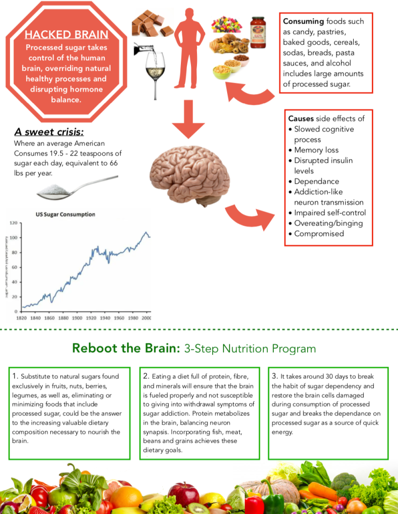
What else can I keep improving in terms of some sections of empty space? Any other information worth mentioning? Do I have a hierarchy of 3 levels now?

An Information Design Class @ Princeton University

What else can I keep improving in terms of some sections of empty space? Any other information worth mentioning? Do I have a hierarchy of 3 levels now?
I do agree that the top section of your project has a lot of empty space. This section also isn’t the most visually appealing to the eye. That being said, I love the layout of the bottom section and think you should try to implement that feel into the other sections, so that the sections coincide with each other. This will also be more visually appealing and easier to understand for the viewer.
LikeLike