
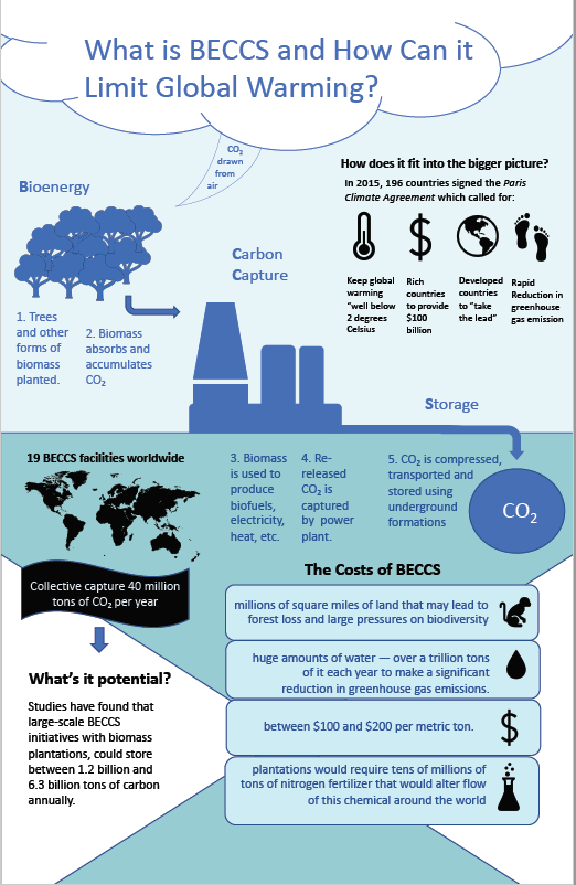
My information design attempts to explain a technological energy process known as bioenergy with carbon capture and storage (BECCS). The core idea is burning trees or other plants for energy while pulling in the resulting carbon dioxide and storing it below ground. Since the plants pull more carbon dioxide from the air, the process results in a net removal of the greenhouse gas from the atmosphere.
I’ve kept the color scheme simple, using the darker blue for the main process and other colors for the following concepts.
A second concept I’ve attempted to flush out is how BECCS fits into global goals of reducing greenhouse gas emission. I do this through breaking down the various components of the 2015 Paris Agreement using easily recognizable icons and short descriptions for each.
A third component is its application and potential application—how widely the technology is currently being used and its future deployment capacity. I’ve used a world map, which I plan on dotting with the location of BECCS facilities, to provide a visual of the global usage of the technology.
The “costs” section introduces a level of tension that is important to the story—that although promising, the technology comes with a sleet of requirements and potential drawbacks for the environments.
I’ve chosen a vertical design to accommodate the main story — the step by step process which involves gases from the air and storage underground.
Currently, I have the following four hierarchies, though I plan on better delineating them moving forward:
- The title, “What is BECCS and How Can it Limit Global Warming. I put the title in large cloud to provide the viewer a clear entry point in. The cloud is meant to represent the CO2 being drawn into the plants as part of the first step of the process.
- The process itself which stretches from the top left hand side of the design to the mid-bottom right side. This is inclusive of both the visual elements and the words “Bioenergy” “Carbon Capture” and “Storage.” The first letter of each word is bolded to emphasize the acronymic nature of BECCS though I plan on spelling it out in the title moving forward.
- The bolded subtitles for all of the other components: “How does it fit into the bigger picture” “19 BECCS facilities worldwide” “The Costs of BECCS” and “What’s its potential?”
- The body of the above sub-stories including the visuals.
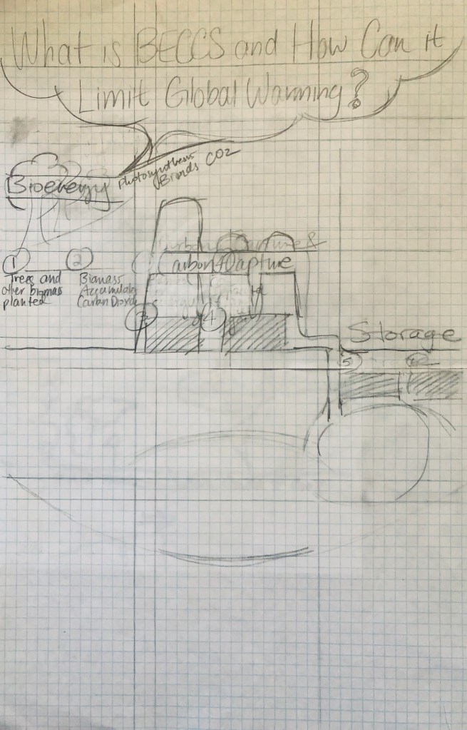
My design process started out with reading two scientific papers that outline the process, an exercise that made clear the importance of providing a clear explanation of how this complex energy process works. Further research equipped me with a general understanding of this three-part process, and I began brainstorming a design on an 8.5 X 11 plain sheet of paper (shown here):

Once I had a rough skeleton down, I moved to a gridded 11 X 17 sheet, per Sheila’s suggestion, which led to the following. Doing so made clear that simply explaining the process was not enough—I needed to be more intentional about filling the white space surrounding and below with relevant sub-stories. Before finishing this rendition, I dove directly into drafting digitally, and as it turns out, the issue of organizing the bottom of the portion remains.
For the revision, I plan on focusing more on graphic forms to explain key concepts, and critically examining all my visuals to ensure they are functional and not decorative. I plan on adding an introduction below the title and a timeline at the bottom. I also plan on resolving the triangle issue toward the bottom, perhaps by replacing it with a simpler shape to divide space.
I look forward to your constructive feedback!

To start, I absolutely adore the color scheme of this graphic. It seems like you utilize around 5 colors with 2 of them being variations of the blue color. While 5 colors could be seen as quite a few, with you able to manipulate the shades to be lighter and darker as to create a new color keeps the composition very appealing and clean. I do feel like there are three levels present in your visual, but I am having difficulty outlining the distinct parts which could maybe be done by implementing borders or having more distinguished titles by a variety of font boldness or size.
I love the way you utilize arrows to establish a flow across the page; the title, which is incredibly striking with posing the question as a way to hook the audience, then leads to the defining aspects of BECCS one by one. The arrows help guide my view in an effective manner and outline the structure of the information. I love the visuals as they are very simple and easy to understand and most importantly they do not compete with the text.
The information is very clear and the way you are able to explain the process. I appreciate the way you break down the information into categories to gauge my understanding of the topic. I think you did a great job isolating the necessary information without the irrelevant sections. In my opinion, your visuals already seem to ensure that they are functional and not decorative., but in terms of improvement I do agree that maybe the spacing towards the bottom is a bit distracting. It seems like in that section there are a bit too many shapes intersecting with the overall composition.
LikeLiked by 1 person
Your poster is very creative, I love the title and how it’s in a puss of smoke. When the imagery around your title is creative, it gives you some leeway (I feel) when it comes to the actual words in the title. There is a lot of information being delivered here, but the arrows you added, as well as the numbering system help to guide the viewers eyes. The margins you chose were a little close to the edge for me, at least in the upper half. Adding some space would create a more defined area for the information. I think you use a lot of icons, and i don’t love that there’s not continuity in the icons in the top vs the bottom other than the one. I also think the words in the blue boxes should be capitalized for consistency with the rest of the poster. Your use of color is good, I like the blue-green color scheme with different shades of blue. I think you could highlight certain areas of information to create a more clear understanding of the levels in the poster.
LikeLiked by 1 person