

Through this project, I’ve realized how difficult it truly is to create infographics. Up until this point I think I’d been taking most of the skills required for granted. I was overwhelmed by all of the information from the scholar journals that it sent me astray as to what story I want to tell with my visual. I think in general I want to talk about the complexity of steering mechanisms and how that’s connected to the powerhouse of automobiles. Ultimately, I want to show how electric vehicles are changing these systems and consolidating it to a safer and more efficient system. The core concepts are: wheel alignment, power sources, and the different ways these are applied in electric and non-electric vehicles.
At this point I have selected a radial grid, However, I am finding this to be somewhat inefficient when attempting to tell my story. I think I got carried away by the awesome graphics I created detailing the wheel alignments. In this graphic, there are a series of concentric circles representing the circular pathway of each wheel in a coordinated turn. These circles made it easy to try and implement a radial grid. However, I believe I can get away with implementing the seemingly radial image with a standard grid.
Clearly there are a lot of differences between the driving mechanisms in electric vs non-electric vehicles. I can spend more space describing and educating the reader on specifics of these systems to see the full spectrum of the system complexity. I believe that trying to stray away from the radial grid will allow me to pack more information without it being overwhelming to the reader. At this point it might be a good idea to start over and re-imagine my first draft completely. Now that the context is a lot clearer I can see the big picture and create a much better infographic.
I think it might be a good idea to organize the information in a hierarchical structure. This will allow me to introduce the system as a whole, then break it down with sub-sections describing special parts and mechanisms. Utilizing a standard grid will also facilitate creating a hierarchy that is easy to follow by the reader. This also facilitates the choice in graphics, as there is no need to worry about removing backgrounds in images to fit into the overall design.
Color scheme is one thing that I think I have settled on. A gray and yellow color scheme is visually pleasing while also maintaining simplicity and avoiding distracting the reader. Clearly I did not do too good a job at creating a first draft and looking back I should have included more information in the visual. I was taking an additive approach (adding on information that would be found missing), where I should have been implementing a subtractive manufacturing method. The approach I hope to take moving forward is to basically bleed on the paper in a visually appealing way, including as much information as deemed relative, then gathering feedback from family, friends, and classmates to see what is not relevant to the design.
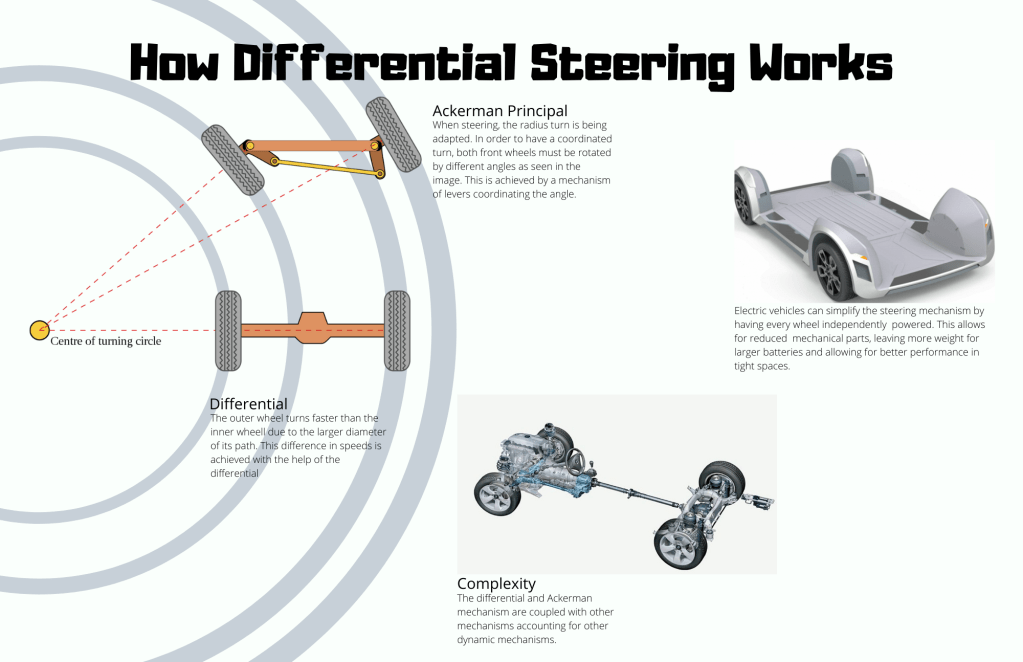

First off, I really like your design here. The background being part of the diagram and extending to the boundaries of the page I thought to be really great. Your title is no-frills and informative, which I think is good, but maybe could use a subtitle or small paragraph below explaining some of the context of differential steering since most people won’t know that term. I have a bit of trouble following the flow. I look first to the Ackerman Principal area, then to Differential, then to Complexity, and then to the Unnamed piece. I think perhaps they could be better arranged in the space and I think it would be great if the text for Differential made it off the patterned area. Your graphics are great, and I like the mix of both diagrams and 3D rendered models – super cool. I think the biggest area I see for improvement here is the spacing and placement of your elements, it feels a little random right now. One last thing is that would make sure the background of the Complexity model matches the background of your whole piece. And since you have room and have tackled a really complex topic here, maybe add some more explanation. You say “this difference in speeds is achieved with the help of the differential,” but nowhere do you actually explain what that is. I really like where you’re going with this aesthetically, but after reading through it I’m not sure I understand yet how the process works. I think this is a really good start and your graphics are amazing
LikeLike
Hi Jose,
This is a neat topic to be working with and you’ve got a really good start here. The strongest part of your piece is your use of the turn radius both as a visual explainer and as a structural tool to divide up the space. It’s clever and effective and lends itself to a fairly clear broad structure. Though the white space is somewhat balanced, I do think there is too much of it on the right side of the page, in the two square areas near the middle and bottom right hand corner. Perhaps you might consider including bits about the history, the usages, or major characters involved in this sort of steering.
The content on the page is fresh and engaging, and overall title does the job of giving the viewer a heads up about what story you are trying to tell. I think it’s important to give a bit more context on the two photos of the electric vehicle platform and the motor with wheels. For those who might not have a science background, it could be hard to tell what we are looking at or what we should be paying attention to in those pictures. Are they meant to contrast each other? Are they meant to be different examples of differential steering? At the very least, label would help.
Your use of color is effective, as is the typography. If you add more content, be sure to differentiate between the extra hierarchies and continue to think about how you might use the grid to help you organize the smaller stories.
Overall, your design got me interested in differential and has me wanting to know more. Keep it up!
LikeLike