
The main story I was trying to depict with my magazine visual was the importance in highlighting the difference effects that PTSD has on women opposed to men. From my research I had discovered that women experience dramatically more intense symptoms of PTSD than men, and I feel this issue has not been depicted well in modern society. For example, I myself would have assumed both men and women experience the same symptoms when diagnosed with PTSD, hence to learn about how it differs was a topic of interest for me.
The core concepts I was trying to explain with my piece of work are ‘what is PTSD?’, ‘what does PTSD feel like?’, ‘how can you treat PTSD?’ and ‘where can you get help?’- essentially trying to inform the reader in the best way I could- the simple aim of information design.
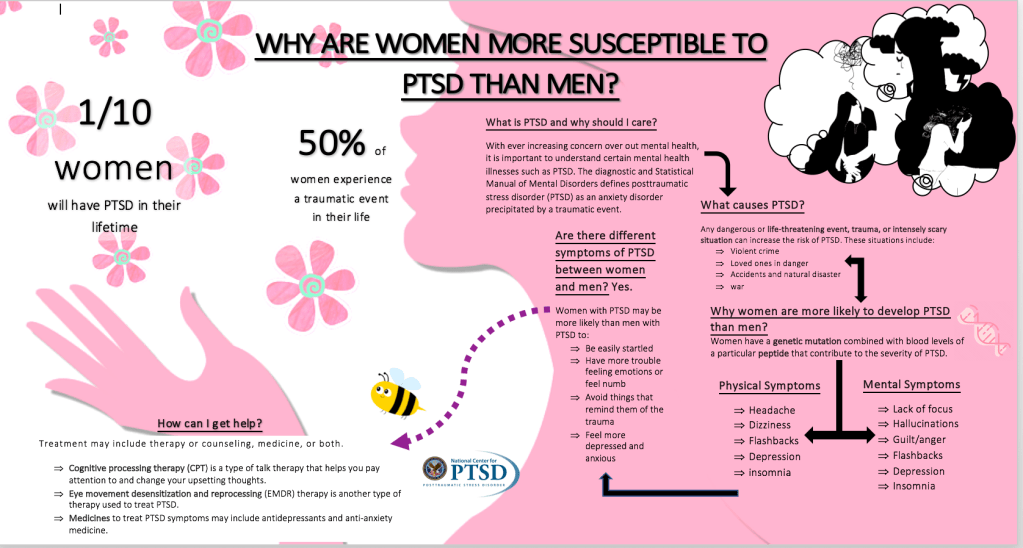
To deliberately emphasise to the reader I was interested in women in my visual design, I purposefully used pink and flowers to visually appeal to the reader. The largest text is the underlined title “Why are women more susceptible to PTSD than men?” which I made the entry point of my visual design. This intrigues the reader to find out more about the topic as a lot of them probably do not know the answer themselves.
From the title, I would then say the secondary level of my visual design are the ‘fun’ facts dispersed in the white background area of my design. They are alarming statistics meant to further attract the readers attention and encourage them to keep reading more about my topic.
The third tier of my design is then the connecting storyline with subtitles which first defines PTSD, explains causes, shows symptoms and then explains the difference between men and women. There is a certain logical order to read this, and for it to simply make the most sense to the reader. Hence I used arrows to guide the reader’s attention along each subtopic in order for it to make the most sense to them and with the least amount of thinking required.
I purposefully used black and white images of a distressed woman inside a thinking bubble in order to portray visually darkness and mental health, specifically in women.
I purposefully put the ‘How can I get help section?’ in the white zone with a distinctive purple arrow to show ‘there is light at the end of the tunnel’ for this traumatic mental health condition and the smiley bee is also meant to depict hope and light. The backdrop of the woman’s silhouette blowing flowers into the air is also meant to depict freedom from the stressful images in her head. So overall the visual design is meant to enlighten, inform and provide positivity in the sense of being informed of what the condition is but also how you can get help.
I tried to minimize visual aids to just the picture of the genetic mutation, distressed images of the woman in black and white and the bee, as I was aware the background silhouette of the woman would have a great impact and attract the reader anyway. The next best way to inform the reader after attracting their attention was through my writing.
Overall, I hope I was able to depict some of things I am talking about from my visual design. I kept to ‘less is more’ by keeping the text simple and easy to read, as well as roughly 3 different colors so that it wasn’t too alarming for the reader. Furthermore, by using cartoon visual aids more than real life photographs, I did this to make this visual design more applicable to everyone as a picture of specific women in distress could in a way limit my audience to people who only associate themselves to that specific image. It needed to be applicable to all to attract a large audience and inform, hence the less personalized photos. It also keeps the imagination open to how PTSD could look to a reader, as I learnt from my research it comes in many different forms. Overall, I enjoyed making this project and hope you learnt something new from it too.

Your visual looks very pretty! I like the metaphor you did with the women and flowers. However, I think that big pink figure along with flowers are also confusing if someone were to look at the visual at a glance. It seems overly cheery in contrast with the topic. I would make the figure a bit lighter or transparent, or perhaps make it take up less of the page. I think it would also be cool if the black and white image was closer to the women’s brain rather than her hair. I would also get rid of the bee, as it is a bit distracting. The informational text could also be a few sizes bigger, as it is currently very small in comparison to the background figure.
LikeLike
The test seems cramped within the figure, as well, so more could perhaps go in the white space to provide bigger margins within the elements. I think the arrows are confusing, especially the arrow that goes both ways. I don’t see enough of a progression between the pieces of information you give to warrant arrows. Try guiding the reader’s attention in a different way, like by putting your sections in order from top to bottom. I like how you used a question in your title, so your audience understands what they should be getting from the poster. I also like the stats you included among the flowers; they are a good introduction to the topic. I think you could put more emphasis on the 1/10 stat by perhaps having a visual. 10% could seem low to some readers and insignificant on its own.
LikeLike
Your draft is nice! I like the use of figure and ground, which is very fitting for the information. Everything is aligned nicely, as I can see your use of grid, and there is a clear level of hierarchy. I appreciate that you’ve left some negative space, so that it’s not cramped. The text in the pink could be spaced out a little more because I feel like it’s not as balanced as the text in the white space. Although I like the use of the flowers and the woman figure, I would suggest making them not as bright because I feel like they guided my entry point, rather than the title. Also, when reading, I was a little confused on what the image at the top right was suppose to show. Perhaps, a caption would aid it. The arrow from “what causes ptsd” and “why women are more likely” is also confusing because I was unsure of what the double sided arrow was suppose to signal. I like that you used a bigger font size for the statistics because in a way, it draws the audience in about wanting to know more about the topic. Overall, this design is unique and dynamic!
LikeLike