Starting the project, I decided to go with a topic that I not only had a profound interest in but also one that outlines a societal issue. With my genuine regard for nutrition-related research and the deeply persistent problem related to the American diet, I settled on the academic study of the processed sugar controversy, its hidden existence in conventional foods, and the negative effects on the body and brain. The first step of the entire process was one of the most crucial, in my opinion, as I had to efficiently read, process, and annotate through copious amounts of information published in two scientific research papers. Through an analytic lens, I determined the primary, secondary, and tertiary points of information. By grouping the information into subtopics, I was ultimately able to create the distinction between where the processed sugar is found, how it affects the brain and the overarching effect on society shown through the rapidly growing sugar consumption levels. With this information, I knew it was imperative that I came up with a creative title; I thought long and hard to satisfy the goal of a striking and clever title. I came up with the title “Hacked Brain” to represent how with high amounts of sugar hidden in conventional foods, the processed sugar enters the body and overrides the control over the human body & brain almost as if processed sugar sits in the “driver’s seat” (which was the title for one of the subsections in the cycle). This first step took two trials because initially my design decisions were driven by the idea of making a graphic describing the difference between 2 types of sugar. However, based on the readings I was looking at, it was not the primary focus that I could create the most enticing graphic with. Therefore, I made the decision to shift the focus on sugar content and the overarching effect on the society as a whole to show how national consumption grows and the health implications of processed sugar until eventually outlining an effective plan and steps for prioritizing health over sugar addiction. I felt like the second trial in extracting information related to this topic rather than my first idea shows a more meaningful dynamic between individuals and society rather than just describing the molecular possibilities of sugar content, where each is found, and the differences in-between.
The color scheme of my design contributes to its high level of legibility in order to distinguish the characters and the individual parts throughout the piece. Intentionally using color, I separated the overall graphic into two sections: the top section, using lots of reds, describes the negative impacts and effects while the bottom section is done in the green color symbolizes the health and vitality synonymous to the way of “Rebooting the System” through healthy steps one can take towards fixing the issues associated with processed sugar consumption. The white background throughout the design ensures that there is a necessary high contrast environment throughout my design as well as a clean canvas for the various visuals. On theme with the high legibility goal I set forth for myself, I used the “Avenir” font that achieves that goal. Additionally, working with different font sizes and boldness that signals the levels, subsections, and importance with lots of clarity.
I made sure to be very purposeful with the use of images. At first, I was always stuck on the question that we discussed in a class whether the visual contributes value to the overall design or if it is purely for aesthetic purposes. Through several drafts, I have changed the use visuals as well as contextualized them to the information as to ground their use and importance to the focus of the information presented in the graphic so that each visual variable contributes to the overall understanding. The images are also very realistic as to ensure the audience’s understanding without having to clarify what something is. Sometimes a pictograph version of apples or other familiar foods might not be entirely clear to everyone. Additionally, I felt like the colorful and realistic images of the healthy foods look very appealing to the audience since I had the goal of persuading others to look at these healthy options as appetizing. The feedback from Victor was most helpful when he rationalized my idea of having a border of healthy and unhealthy foods would not add value as I already had other visuals that serve that purpose. Victor really made me remember the class discussion of how the decorative component is at times risky and must only be done with purpose and intention and that the visual variables must be used as meaningful information and not as aesthetic decoration.
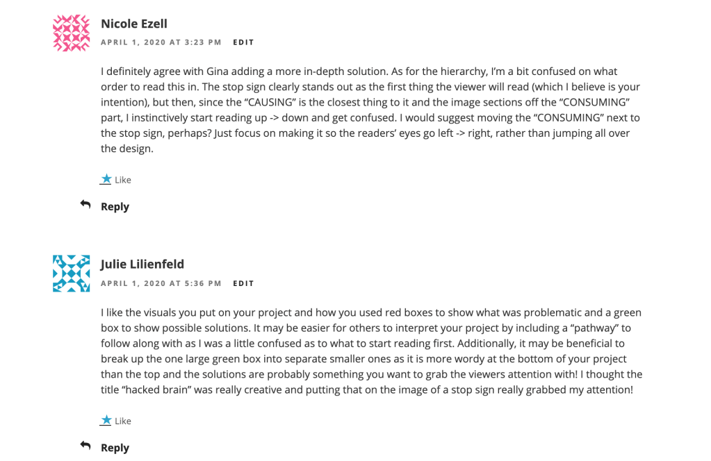
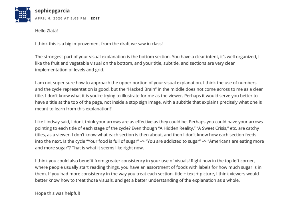
The hardest challenge was creating and refining a clear and direct entry point because it was hard to spacially orient myself within a blank page and copious amounts of annotated information. I utilized a visual composition with a clearly focused entry point that relies on the largest object on the page located at the center in the shape of a stop sign. I came up with the idea of a stop sign shape on which I isolated the title “Hacked Brain” where the red color and words deliver the threatening mood I want to establish with my design while breaking down the negative effects of processed sugar. Initially, I was struggling with the formatting and it took at least four drafts to finally reach the structure of a central entry point with a cycle of secondary information to the title. It was hard for the audiences’ eyes when the title was originally in the corner and despite the larger font compared to other sections it was still unclear and felt aesthetically and functionally unbalanced. The deliberation to change the format to a centered entry point also opened up more space which I did not think was possible. With the centered title and subtitle, I had all the space around it to talk about other information and I realized that the information can logically be connected in a cycle format. Arrows were the most effective way to further establish the flow of my graphic so I felt like they were imperative to my design between the three main sections in the cycle section of my graphic. This way, I felt like the structure was balanced as well as the reading flow felt effortless.
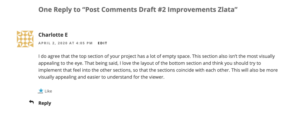
The audience has been incredibly helpful in giving me feedback. I felt like the comments always gave me a new angle to look at when it came to my design. Especially when I had three separate drafts, it was helpful to get feedback on what works well and what doesn’t across different versions. When I received feedback regarding shortcomings in clarity, I was sure to address the errors, however, always keeping an analytical cap on because some feedback was not particularly stylistically accurate. When we received the high school comments, I made the changes almost as soon as they were left on my draft and felt that the changes I made were substantial enough to re-upload the new version to the blog and luckily I got another person to comment on the new version with very encouraging thoughts that not only kept my spirits up but also generated more thoughts and creativity. At first, I was concerned when I received feedback on what I thought was my final draft where the comments said that the cycle I chose does not particularly work with my information. I had to recognize that it is a personal preference and that I cannot satisfy all of the audiences so I stuck by my artistic decision to keep the cycle set up. Then I also reached out to Professor Sheila and followed her advice on grounding the title a bit with a subtitle message to go with it to describe the relevance and structure of the cycle. Sheila also recommended in her final comments to bold certain words in the text to make the text more accessible thus increases the readability of the text by bolding keywords. I really appreciated that and incorporated it immediately because it was not something I thought doing in this graphic despite the positive effect bolding key words has on the text sections.
After these waves of feedback, I feel very confident in my design because I know I have done lots of trial and error testing. Reflecting on the process, I am very surprising how much improvement came from being receptive to and engaged with feedback and how much not being lazy to create one raft after another could improve work. I have never followed such meticulous steps in creating work and I know that these steps could turn into habit if I keep practicing design through this approach. I feel like I was very proactive with all of the feedback I received because I made changes right away where I saw fit while staying loyal to my tastes and preferences while still in line with the user experience.


