I began my process of information design creation with the goal of holding simplicity above all other pursuits. I wanted to avoid extraneous graphics, colors, information, or formatting. I distilled a complex scientific process down into four sentences and an unimaginative four steps, nothing else. My pursuance of simplicity in order to make a topic understandable led me to overcorrect and make it useless, boring, and visually vanilla. In my mind, I thought since I had followed all the rules we had learned in class, I had created a good piece. In that, I was very wrong. My first two drafts had one level of information and did not invite reader engagement. There was nothing eye-catching about it, and nothing really went beyond surface level. What helped me make the realization of the issues I had at hand and the subsequent transition in my work was actually looking at my fellow class mates’ improvements and tackling of these same issues between draft one and draft two, changes I was able to begin to implement between the second and the third draft stages. I would like to point out that looking at the transition in Tan Vu’s work was particularly helpful for me to grasp what I was doing wrong with my work and why it was all one level. With the understanding that I wanted to add more information, varied graphics, and overall increase the complexity of the formatting, I began by changing the page orientation. Whether or not this was an impactful or better design move, it helped me start fresh in my mind and work from scratch without inadvertently reverting to things I had already seen and done. Making this drastic pivot has definitely been the hardest part of the process, but I feel as though once I made the big changes, it has been By splitting the page down the middle and then further increasing the breakdown of the leftmost column to add different sections of information, I overcame the single level hurdle. I switched up the color coding that I had been using (i.e. headers had been in pink while information in blue, and I toggle this in the left column) as well as introducing much variance in the types of graphics I include. In the way I present information, I move away from purely necessary graphics and begin to also use graphic elements to highlight information and bring attention to interesting statistics or facts. I also introduce lines to separate blocks of information and keep margins clean. Then, I turned to not only adding extra interesting information, but displaying it in interesting ways. Despite diversifying the content of my visual design piece, I decided to stay true to the font and colors of the rest of the piece. I was still very wary of overcomplicating things since I had started so simplistic with the design, I had reservations about bringing in new fonts, sizes, and colors to the mix.
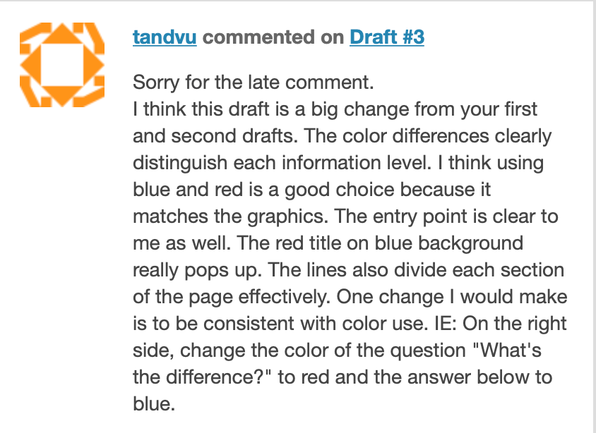
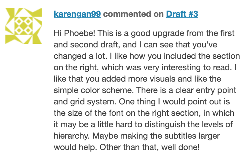
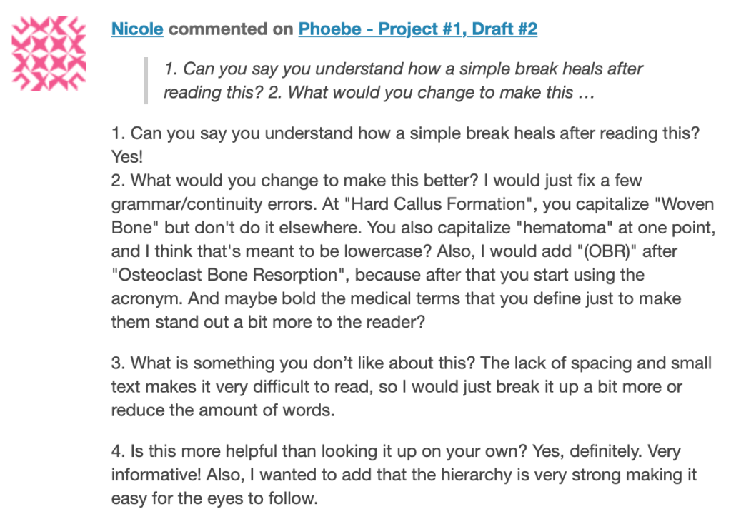
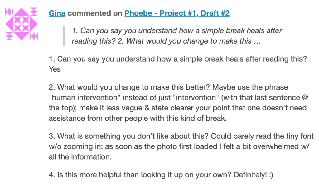
In terms of feedback, I had trouble pulling useful comments from the high-schoolers as every one of their response criticisms focused on the fact that my text was too small, when in fact the comments I had received when workshopping my design in class was to keep in mind that this was a magazine, and it was recommended to me that I actually make my font smaller. So, on that front, feedback was a bit of a dead end. Feedback from classmates who better understood the assignments and the design principles was incredibly helpful and spurred most of my changes. Comments about larger structure errors that my class mates saw were particularly helpful and were the basis of the much larger changes, not just the little adjustments that can sometimes be personal preference. I have provided examples of comments from my class mates in comparison with those from the high school students. I added prompting questions for the high school students like, “can you say you understand how a simple break heals after reading this?” and “what would you change to make it better?” in order to illicit helpful information. They replied very straightforward to the questions without much elaboration, so I was unable to make more impactful changes from this interaction. Above all, what I found to be most helpful in my redesign process was a dedicated section of time in class to just work on the project and talk the instructors through my progress, receiving feedback in real time and bouncing ideas off of others rather than presenting a version and getting one round of comments on that. It was a much better environment for the design process and was greatly helpful in my turnaround.


