
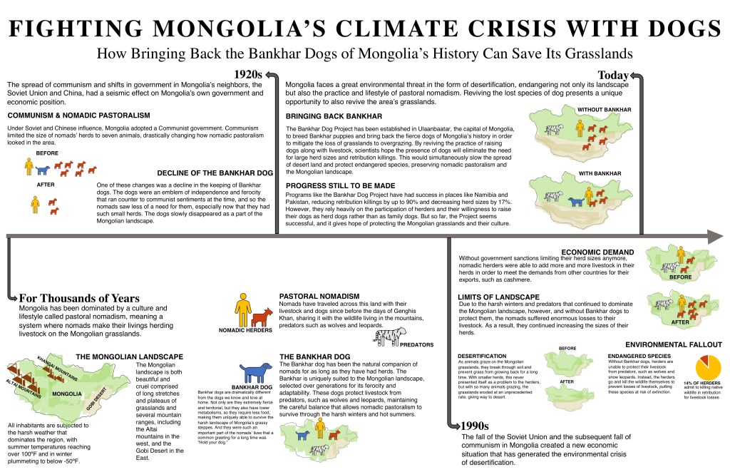
For my second draft, I was really concerned with establishing my content and filling in the graphs I had left in my first draft. I also wanted to use color more effectively. The most notable change is how the content is now organized. I thought a timeline was a better way to organize my narrative and would be easier for the audience to follow; if it were organized into four sequential sections, they would know how to read the page, and at the end could look at the headings and recall what had happened in each period of time.
I received a recommendation for my first draft to create a graph of desertification, because the way I was representing it visually at the time was not effective. However, I also received feedback that wanted to know the distribution of grasslands vs. desert across Mongolia, and I thought that was more fitting as a way of illustrating the spread of desertification, so I implemented greater use of color, and attempted a more realistic depiction of Mongolia’s geography as a way of getting across what I needed to.
In my first draft, I started from my visual representations of animals, but this time around, I tried to write out my content very explicitly, and from there, come up with graphic representations, just as we were taught in class. I finally implemented changes in color in order to improve this iteration, and I think the differences between nomad, predator, livestock, and dog are much clearer now.
The feedback I have received from friends has been mostly concerned with how there are certain sections with a lot of text. My headers for the years are not as clear as I think they are, either.
I want to better illustrate the difference in levels between my time stamps and the rest of the content in each section. And I think I will divide the content under “Today” into two columns for readability.

I liked the use of color that you used from your feedback. The diagrams are also effective to show a solution to the crisis. I do agree with the text being lengthy and headings can be confusing because the years are in different sections. Overall, I think you did a good job with using more colors and I liked using a timeline to show the past and present history of the crisis.
LikeLike
This project was, great, I think you really articulated the ideas to there fullest potential, while keeping your summary brief. Learned a lot of new information from this, glad I read it.
LikeLike
The usage of color is better distributed and more eye catching. When first looking at the timeline, my eyes immediately went to the top column, but then realized that the first “box” was on the bottom. I would try to keep the timeline but configure it in a way that is easier to follow.
LikeLike
Please disregard this comment, I thought it didn’t post so I rewrote it below. Sorry.
LikeLike
I like how you took the previous feedback about the coloring and layout. Although I like the minimalist feel of the project, the timeline is still hard to understand. I struggled finding the beginning of the timeline as well as where each section began and ended. I also think keeping the summaries brief and potentially splitting some time periods up would be beneficial and easier to understand.
LikeLike
There were certain parts (especially the 90s) where I thought the graph did not flow quite as well as it could. You have the arrows pointing to where my eyes go, but then is some part of the graph, I was not sure which paragraph to look at next. The ‘modern-day’ section of the timeline was very easy to read and had a great flow. Also in the bottom right corner in the 90s section of the timeline, the pie chart does not look correct, my computer is running very slowly to the quality was not great, but I thought that the label said “54%” which did not seem to be displayed in the graph. I love the timeline though, I thought that was a great way to display the information, and the topic itself is extremely interesting.
LikeLike