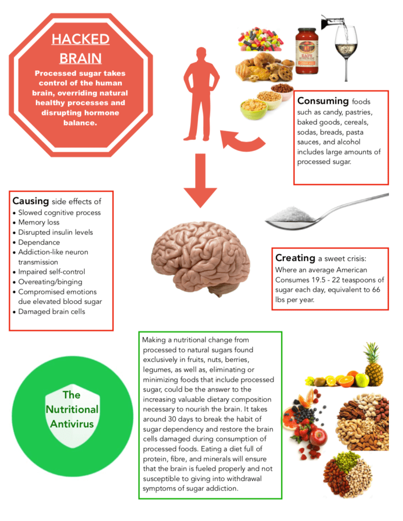
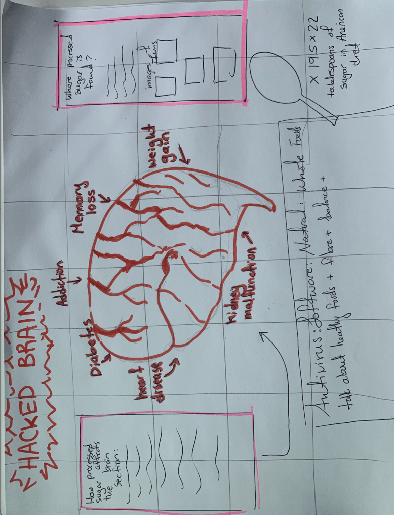
How can I improve the hierarchy and what other information can I include in my graphic that is relevant to the effect of sugar on the brain?

An Information Design Class @ Princeton University
How can I improve the hierarchy and what other information can I include in my graphic that is relevant to the effect of sugar on the brain?

Honestly really like the overall design. You could get more specific when stating your solution, as changing one’s entire diet can seem overwhelming w/o a specific set of initial instructions.
LikeLike
I definitely agree with Gina adding a more in-depth solution. As for the hierarchy, I’m a bit confused on what order to read this in. The stop sign clearly stands out as the first thing the viewer will read (which I believe is your intention), but then, since the “CAUSING” is the closest thing to it and the image sections off the “CONSUMING” part, I instinctively start reading up -> down and get confused. I would suggest moving the “CONSUMING” next to the stop sign, perhaps? Just focus on making it so the readers’ eyes go left -> right, rather than jumping all over the design.
LikeLike
I like the visuals you put on your project and how you used red boxes to show what was problematic and a green box to show possible solutions. It may be easier for others to interpret your project by including a “pathway” to follow along with as I was a little confused as to what to start reading first. Additionally, it may be beneficial to break up the one large green box into separate smaller ones as it is more wordy at the bottom of your project than the top and the solutions are probably something you want to grab the viewers attention with! I thought the title “hacked brain” was really creative and putting that on the image of a stop sign really grabbed my attention!
LikeLike