
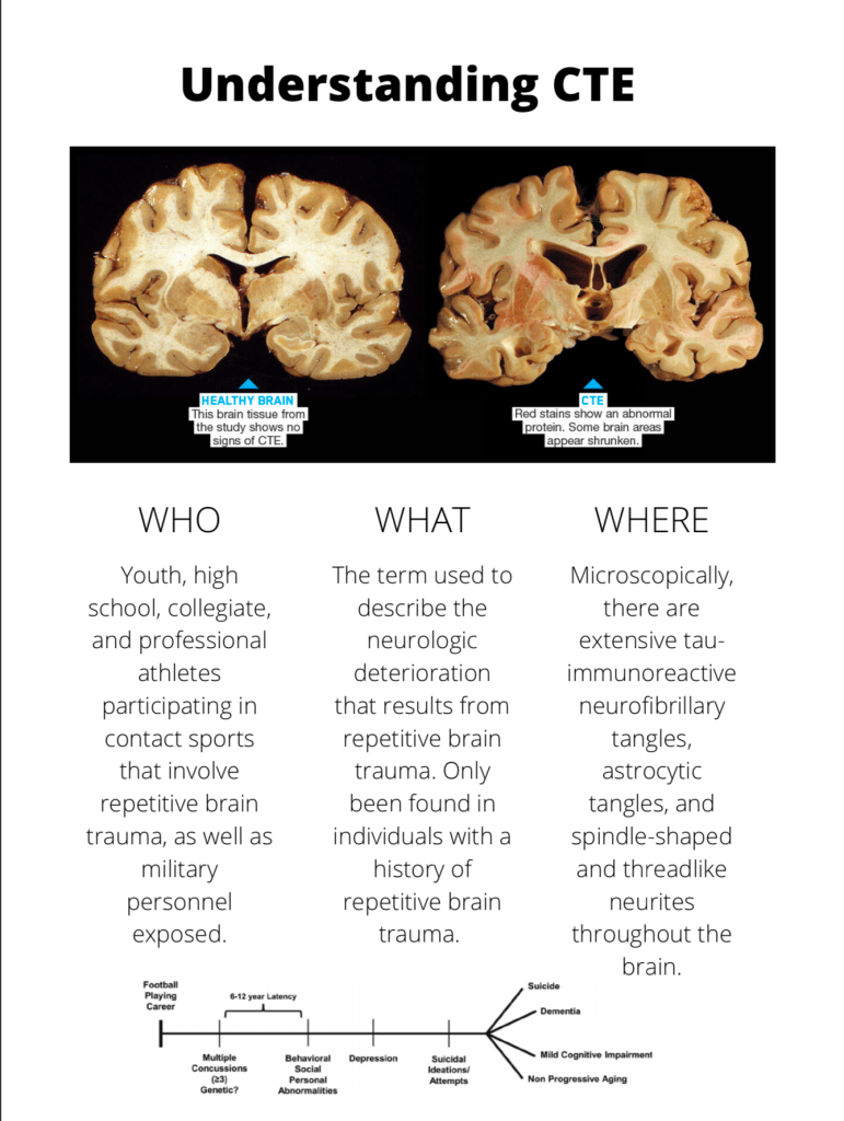
This is my initial draft for the project. It’s quite limited for a few reasons but I can talk about what I have as of now and where I plan on going with it. The way this information is arranged in the scientific papers I found, I felt it would be best to split up the information into the classic “Who, What, Where, When and Why?” Why CTE happens is explained within the other categories, so I decided it wasn’t necessary, and when is going to be explained by the timeline at the bottom. My use of the grid here is decent, but I just didn’t have enough space on the page to represent everything I wanted to put in, I couldn’t find a program that lets you create an 11×17 image. I don’t know if I love my grid being just columns basically, but I don’t know how else i would arrange the information to make it facile. The image was also a bit of an issue, as getting two images of brains, one healthy one with CTE that look similar in format was impossible, so I had to add this one in with an ugly black box around it. Maybe i’ll make the background black? I plan on adding in color to the next part once I find a software that lets me make a bigger image. If the background is black, I’ll go with a lighter color to add some highlight and life to the poster. I think shades of blue would be my best bet, just because blue is such a common color, but I could experiment with things like yellow due to the high contrast. The title is pretty simple, and maybe treating it as more of a hook like in writing would give it more kick. A title that’s a question is a good way to get initial interest, but I have to think of a relevant question to ask. One thing I wanted to add but couldn’t were some “fun facts” about CTE, that I planned on inserting into the columns and breaking up some of the monotony of text. This would also give the graph a better hierarchy, as right now I would say everything is in one level, which is not good. All in all, this is a very simple poster at the moment, but it had to be based on what I had available.
