
Information design relies on certain objective principles in order to arrange information in a way that makes it easily understandable. This is the entire point of information design, and no matter how complex, or simple a design is, if it doesn’t communicate the full extent of the information to the reader in a way that is clear and efficient, then it’s just fluff. Effective use of grid, hierarchy and color scheme are important, as well as apropos use of the Gestalt principles.

Here is my first example of information design, a poster describing how to properly bench press, a part of the Fitnus Chart series by Bruce Algra. The poster is clean, concise, and does a good job of getting across the process of bench pressing, as well as some of the major muscle groups worked. Stylistically, the poster is a drawing that is semi-realistic, mainly aiming to show the general muscle groups. The entry point of the poster is the title of course, and then the eyes flow into the body of the poster. The poster uses color and a legend to highlight the muscle groups being worked, as well as showing the process of a bench press. The use of numbering as well as diagraming the entire motion would be very useful for someone who’s a beginner, which is who the poster is aimed at. There’s a clear difference in hierarchy, with the right side dominating by virtue of being given one solid cell on the grid as opposed to being split into three. The color against a black and white background pops out and highlights the poster, and the fact that the color scheme is simple, but repeated subtly (in between the weights of the machine) makes it stick in a viewer’s head. There is a clear hierarchy, with the title being level 1, the subtitles being level 2, the colors and legend I believe are level 3, then the smaller text being level 4.
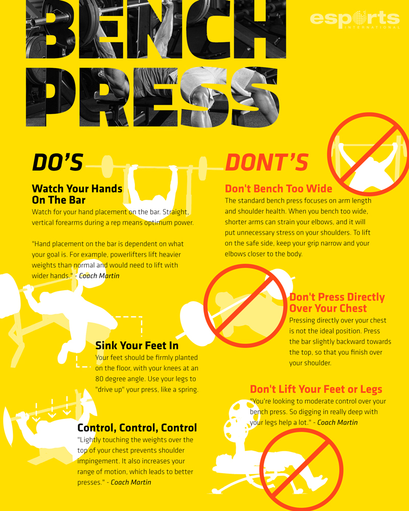
My second example is an example from Esports International. This poster is fundamentally different from the first, as it shows what are some “Do’s and Donts” of bench pressing. This poster has a clear entry point, the title, and then one’s eyes flow naturally into the Do’s. The main issue for me with this poster is the information being delivered and some of the color scheme choices. The biggest mistake a designer can have would be to make an assumption of what their audience knows, and that’s what the designer of the poster does here. The poster goes away from highlighting the process of how to bench to giving tips to giving yourself a good bench. Unlike the first poster, which gives out relevant information about the muscles and diagrams how to bench properly, this poster dances around the heart of the matter by giving out short tips to get a better bench. The issue is that this only gives you parts of what is an entire picture, and it does not actually inform someone on the topic of how to bench press. The color scheme is also an issue, as we talked about in class, yellow and white are not a good color combination due to the lack of contrast between the two colors. The issue goes deeper, as the inconsistency of highlighting either the person or the bench (between the first and second “Dont”) makes the use of highlighting useless as a visual stimuli. The classic prohibition symbol makes it very clear in the poster what they are telling you to do and not to do however, and that is one of the stronger points of the poster.

This final poster is by the ShreddedLifestyle group. It takes a different approach from either of the two posters above, it completely goes away from trying to represent the human side with any sort of drawing in the body of the explanation. Instead it offers a step-by-step direction of how to bench press. The entry point of this one is the title once again, and then the explanation as to what a bench press is. The limitations of this poster come from the lack of representation of the actual movement on the poster. It’s simple to write out the steps for how to do something, but as we talked about in class, you need a human aspect for people to connect with, which this poster lacks. In general, I think this poster is too text-heavy, with the only images in the body of the poster being the icons at the bottom. How the steps are arranged is also an issue for me, as the zipper alignment makes it harder for one’s eyes to flow naturally from one step to the next, and it creates a lot of tension in the eye with the alternating areas of blank space. The steps are comprehensive, but with pictures it would provide a reference for how to do the movement. The section at the bottom holds the poster back, as the title does not match the information represented in the space below. The color scheme is nice and consistent, and it stays simple, with just different shades of blue.
