
The topic of my visual explanation infographic is the factors affecting college major choice. From this poster, I want people to be able to answer such questions as,
- What factors affect my choice of major?
- What kind of person chooses a certain major such as electrical engineering or nursing?
While I was researching for this visual explanation, I read a lot of literature about the lack of diversity within STEM majors and personality types that are most attracted to certain majors. I’d want this explanation to make my audience more informed while choosing a major and to understand societal trends concerning major choice.
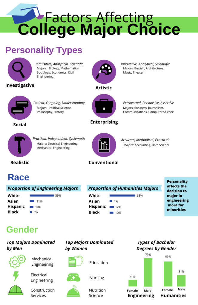
I decided to focus on these three factors fro my explanation: personality, race, and gender. I chose these factors because I thought they did a good job of highlighting how many STEM fields are white male-dominated. I included personality as well because I think that this factor makes the choice of college major feel more personal. College major choice is affected by both internal and external factors, and I wanted my explanation to reflect that.
For the personality factor, I chose to use the Holland’s model of careers. He came up with six different personality types to explain the “student-environment fit”. I thought this model was perfect for the poster because each personality type could be matched with a visual. Personality is a factor that reflects an internal reason that people major in something. I included the sections on race and gender as external, societal reasons that lead people to choose a major. These two factors were good to choose as well to reflect the lack gender and race diversity within STEM.
Each factor of the poster has a different accent color, either purple, blue, or green. I thought three colors was a good number to have without being too many. The different color for each section gives each section a distinct feel. The title accents include the color for each factor to tie the sections together. I created the poster with 6 different levels:
- The first level is the title level at the top. The font is bolded and a large font to indicate that it as an important level that communicates the topic of the visual explanation.
- The second level is the titles for each of the thee factors. They are the second-largest font size and are the only text that is not black. They all come at the top of the section and provide a standard introduction to a new factor across the visual explanation.
- The third level is the italicized and bolded words. This level is meant for the titles of the subsections explaining how the title factor contributes to major choice. When I improve upon this visual explanation, I will go back and add a title to the personality section, probably Holland’s Personality Model. It would be nice to give the audience the title of the personality model in case they would like to do further research and to accredit the model to Holland.
- The fourth level is the bolded text. This level provides important details that aren’t the title of a section. You can see this fourth level in the personality type names and the race categories.
- The fifth level is the italicized text I used in the personality section to describe adjectives related to the personality type. As there are three different levels of information in the personality section (the personality name, descriptive adjectives, and related majors), I thought this level would be helpful to distinguish between the adjectives (which act as a subtitle to each personality) and the related majors.
- The sixth level is the plain text seen throughout the explanation. It provides explanation information for the section.
In revisions, I’d be open to refining my levels. I think I may have too many right now, and they aren’t as cohesive as they could be throughout the poster. I’d also be open to considering different data to display the major choices by race and gender. I think the current data I’ve displayed is a good introduction to the section, but I could possibly include more. I also think it could be cool for me to show the relationship between each of these factors more as I did for the fact box on the right of the infographic in the race section.

Hi, Lindsey! I find your draft really effective.
I think your structure is very clear. I can clearly see the use of your grid, the white space is well-balanced between sections and keeps your work approachable and easy to read, your six levels organize your content very clearly, and your sections are distinct, clearly marked with your change of color.
I think your title provides a clear idea of what topic you are addressing, but it might benefit from a subtitle further explaining the idea that different personalities weigh into one’s choice of major, or that there are variations in majors between personalities, racial groups, and gender, or just something to give a better impression. I think a subtitle beneath your Level 2 titles would also be helpful–are you trying to just tell people that gender affects what major one chooses, or are you also (briefly!) trying to explain how?
Otherwise, I find your design really engaging and effective. Your use of color is awesome, leaving no question of the differences between sections, and I found your icons at the beginning really simple and well-implemented, as well as your graphs in the second and third sections. Your visuals take clear precedence over your text, which I think is a great thing, and it makes your content very clear.
Good luck with the rest of the project!
LikeLike
Lindsey,
Overall when first glancing at your poster, it is very visually appealing. You clearly made some very diligent choices that work very well, here are some small details I noticed most about your work that can be improved upon:
Structure:
Your poster’s structure is incredibly clear for the most part. The title is clearly the first level, and I like how you used all the colors from your poster in your header (it makes it nice and cohesive:)). I think the title is very straightforward, one thing you might want to add is a little text section below to explain the overall concepts you want to convey from your articles? Since the text in the poster is all related to the data you give, having a small explanation to “humanize” the data can hook the viewer in and give more background to what you are trying to say.
The three different sections are clearly delineated using your three different colors, which I believe are very well chosen. I like that the colors are similar enough (same side of the color wheel) but also different, which is soothing for the brain and makes the viewer understand that you are just trying to create different sections rather than contrasting all the data if that makes sense?
I agree with you about having to refine the levels. The first few levels are very clear, but then there starts to be confusion regarding bolded text versus bolded and italicized text (ie it isn’t clear if the bolded+italicized has more value than only bolded). I think if you adjust font size and color that will be more effective to indicate your levels rather than having all the same color/size.
Content:
The content you included is very clear. Since most of it is data, I think you have even more room to include other facts, or add some descriptions to each section. Like you mentioned, writing that you used Holland’s Personality Model and describing it can be good to add. For your personality types, each type is distinguished by an adjective, but then your description of each personality consists of only adjectives. Maybe adding characteristics: inquisitive, analytical etc… and then having that on the same level as the majors associated to each personality could help you combine some levels. Other than that the content in the other sections is very straightforward and digestible, you can add some other facts and information if you want but I understand everything you are trying to convey throughout the entirety of the poster.
Design:
For the first section, I can clearly see how you used the grid. One thing I noticed is that this section doesn’t look very centered, what would you think about creating a circular part with the graphics/circles and then having descriptions around? Or try playing around with the placement of the circles to make the page look more symmetrical in some way. Also, maybe making the title a more saturated color compared to the circles would make the title more distinct and on a “higher” level than the circles.
For the second section, the content is very straightforward and so is the design. I think if you distinguished the font size and weight between “the proportion of engineering majors” and “white/asian/hispanic/black” etc that would make the levels more distinct, and then you wouldn’t need to the blue box around the subtitles. I don’t know if the flag boxes add much in terms of meaning, and I’m trying to find a link between those and the blue box on the right. Also, since all the text in this section is bolded (other than the numbers), this doesn’t create importance to any of the text.
For the last section, I like how you separated the three subsections. I don’t think the italics are necessary if you make the “engineering” and “humanities” a smaller font. If you play around with those font sizes/weights, the levels will become very clear. For the pictographs you used, I think they are good and they are a good balance with the bar charts, but maybe having some symmetry between the pictographs in the first part and the last part can make the poster more visually cohesive? If yo choose to stick to circles surrounding pictographs above, maybe you should reiterate this process in the last section. One small detail, the “construction services” hat has dark borders which makes it stick out more than the others. Other than that, looks great!
Overall very good first draft, I know I was being very nit-picky but that’s because the main features are really great! Keep up the good work!
LikeLike