
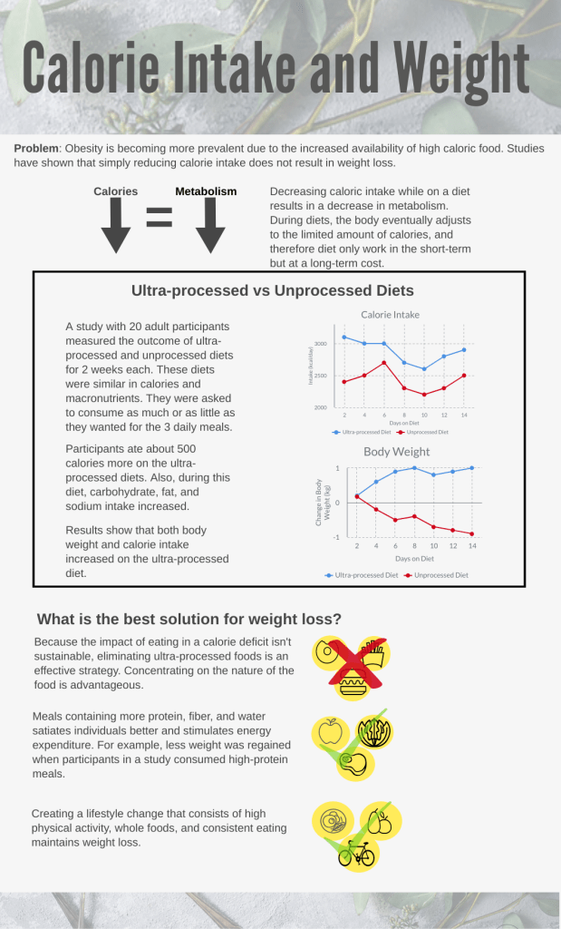
The premise of my scientific journal papers was calorie intake and weight. A study was conducted to compare the effects of individuals being on an ultra-processed diet that consisted of processed foods vs an unprocessed diet that focused on consuming healthier alternatives, like whole foods. The whole experiment occurred over the span of 4 weeks, in which the participants underwent both diets for a 2 week period. Once they finished one diet for the 2 week period, they switched to the other diet. They were given the same amount of calories for each diet and were asked to consume as much as they wanted per meal.The results of the study showed that individuals tend to eat more calories when on the ultra-processed diet, and so they consumed more macronutrients, such as carbs, fats, sodium, etc. The study also found that during certain meals on the ultra-processed diet, participants would consume more carbs vs fats, compared to the unprocessed diet. The second paper contributed to these findings by explaining that weight loss goes beyond calorie counting, where individuals should take into account the types of food they’re eating by focusing on eating healthier foods and should look more towards long term goals. It also explained the concept of energy consumption and metabolism while citing many studies to support their claims.
For my draft, I wanted to get the main idea of the first study by showing the effects on calorie intake and weight through graphs because this finding was also supported by the second paper. I didn’t go too much into depth about the more detailed effects of the diets, such as the change in glucose or insulin because I wasn’t sure how it would fit in/if it was necessary to get the main message across. Since both papers were motivated by the rise in obesity, they also included solutions for weight loss, which is conveyed at the bottom of my draft. I organized the information as a problem, then showing supporting evidence, and concluding with solutions to mitigate the problem.
I displayed my design based on a grid and squared off the information in the middle to separate it from the other text and to emphasize that info because I thought it was more important to focus on. I sectioned off the information using a larger font and added the descriptions in a smaller text with lighter typographic weight. I also created two graphs, which were included in the first paper, to visually represent the changes in calorie intake and weight. In the bottom section, I included pictographs as visualizations for the corresponding text and used checkmarks or an x mark to signal the beneficial solutions. I tried to keep the amount of color to a minimum and just kept a neutral background with black text for high contrast. I placed the title on a dynamic background, which I may change because looking back at it, it may seem more decorative than informative. I may play around with the order of the elements in the next draft.

I really like the overall structure of your design as it has a very symmetric and logical flow established through the central distribution and the white space around the text allowing me to not feel overwhelmed with information. I love the aesthetic feel of the margins at the top and bottom that also align with the topic of your information design for a nice clean and engaging feel. The sections are clearly defined with the use of borders and varied sized captions and titles for the information presented. There are definitely three levels present with the problem, differences, and solution sections.
The title I feel like is a bit clinical and very direct. While it explains exactly what you want to talk about in your graphic, but it feels like it does not particularly hook in a clever and engaging way. It gives a clear understanding but personally, it does not provoke my attention. Also, I feel like the title is missing a subtitle and, instead, goes directly into the problem of your main topic.
The design piece is very well done so far. I love the symmetry of the configuration as well as the high contrast yet neutral color-schemed environment. Everything is easy to read with the background and font color, as well as the cohesive aesthetic experience. I do feel, however, that the yellow graphics in the solution section feel a bit out of place with its brighter nature of the striking yellow color. Also, you have visuals in their pictographic format, but I think that it could create a more relatable human experience with photographs of the things you are trying to represent like the healthy and unhealthy foods and what seems to be exercise equipment. But I do think that the yellow visuals begin to compete with the text around it, which is something to evaluate and decide if that could aid the graphic.
LikeLike
The way you approach the poster is good I feel, as you address a problem initially, giving everyone an entry point, and telling a story throughout the entire poster. The title is very large and eye catching, and it provides a clean entry point, and I like your use of symbols and icons throughout the poster. I think you have a well defined hierarchy here, and your use of the grid is evident. Your margins are wide enough so there’s not a great deal of tension in the eyes, which is good. I like that you boxed off the information in the second block of the poster, as it creates separation of the information. Your title is very literal, but it could be a bit more engaging. Questions are an easy way to get interest, and a topic like weight loss would connect to most people out there, so finding a relevant question to ask should be easy. Your design is nice and simple, the green color scheme works with the leaves in the background, and you don’t overcomplicate it with too many colors. I with the graph had a shade of green rather than red and blue though, as it would work a bit better with your overall color scheme.
LikeLike
From your design and reading what you wrote about it, I agree that your use of neutral color for this design was overall an effective measure in order to effectively convey your topic of calorie intake and weight. By using simple colors you do no overwhelm the reader and hence make it easier for them to read and understand what you have chosen to write about. It doesn’t seem as “frightening” as it could if you potentially used a lot of colors.
I think your use of graphic definitely does increased the legitimacy of your design and does provide a different visualisation for the reader rather than just words and images.
Your use of icons in the best solution for weightless however could be more effectively conveyed. I see 2 rights and one wrong in your solutions. It is hard to distinguish the healthy eating icon from the exercise icon in terms of the 2 rights, I would just have thought from not reading it that you mentioned healthy eating twice in terms of the two icons hence you could maybe make more effective use of this space? By either emphasising exercise more or changing the icons to 3 clearly different topics for solutions of healthy eating. I hope this makes sense!
Overall, I liked the structure of your design, I can see the use of a grid somewhat and there is a clear entry point of the title which is the largest font and in bold. Good first draft and well done!
LikeLike
Hi Karen,
The strongest part of your design is its clear and easy-to-follow structure which leads the viewer in from the top, followed by the short deck with introduction. It’s effective in its placement and functionality.
I think your title could do more in terms of engaging the viewer and revealing the tension you are trying to get at throughout the rest of the piece. For example, “Fighting Obesity: Cutting Calories is Not Enough”
It’s also important to give more context because some people might not be familiar with technical terms such as “ultra-processed” and “unprocessed.” You might even think about add visual examples of ultra-processed vs. unprocessed foods, examples that viewers can easily identify with.
I think it was a good choice to add the three three-part visuals at the bottom to illustrate the best solutions for weight loss. You might also consider adding a short few-word caption for each to make clear what the solution is.
In your revision, you might focus on the spacing between elements and cutting the text to include only what is absolutely essential. For example, there is very little space between the boxed section and the paragraph on top of that, which might throw the viewer off balance. In terms of the text, you could, for example, visualize some aspects of the study like the participants and the three meals a day, and have less words in the first paragraph. This would take the strain off the viewer; no one wants to read a long black of text.
After looking at your design, I was intrigued by this topic. Some questions I had that you could address in the form of sub-stores: how does the body eventually adjust to the limited amount of calories? How much exercise is appropriate? What are “whole foods”?
This is a great start, and I look forward to what you’re able to come up with!
LikeLike