
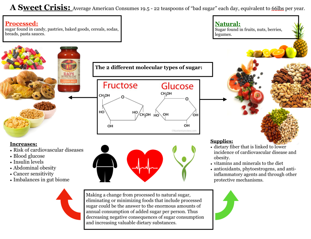
The main story that I wanted to tell with my graphic is the difference of the 2 different types of sugar on the molecular level and the health implications associated with the consumption of either fructose or glucose. The purpose of the graphic is to educate the audience on the types of sugar, in which foods each type of sugar is persistent in, describe the health effects of consumption of each as well as provide reasoning to eliminate one type of sugar over the other. I hope that this graphic educates the audience on the negative implications of consuming sugar as well as form a profound association with which foods are full of processed and natural sugars.
The focus point is meant to be the center that outlines the two sugar categories and to further clarify the flow from the center outwards I included arrows that lead to bright, vivid and most importantly realistic visual representations of foods that are either formed from natural or processed sugars. The choice to use pictures of real foods allowed me to form a familiarity of human experience to my graphic as it is easy to associate these realistic representations and form connections with the information presented from the highly abstracted molecular level to the closely familiar images of common foods in the American diet. However, I think it will be important that I add captions to each of the food’s visuals because it is possible that some people might not be familiar with some of these foods and it would be unfair to assume that the image of nuts and legumes is clear to every single person interacting with my design.
I used the color principles in a meaningful way to categorize the good & bad sugars with the foods by relying on cognitive assonance and ascribing the green to natural sugar foods considering the association of green as conventionally considered healthy and the red for processed sugars due to red conventionally considered as unhealthy. I realize that I must also change the red color on “fructose” as it is a good sugar molecule, yet the graphic I found already came with the red title that could be confusing in understanding that “fructose” is good. I always made sure to keep a very high contrast environment by using a plain white background and primarily black font, as well as the Times New Roman font from the legible Sans-Serif font family. Aside from the written information, there is a wide mix of color within the images which is because of the realistic nature of the visuals that represent a variety of fruits, grains, pastries, cereals, etc… I wanted to implement photographs into the graphic to ensure that the distinct foods were understandable and relatable to the audience.
So far, I tried to utilize the grid in a balanced and symmetric setup; therefore, the graphic has the two main categories that are secondary after the primary title. These two categories are set up as two columns on each side of the central focal point. The levels are defined by the size shifts from the title being the largest, to the two categories being smaller and the final subsection of health implications being the smallest.
The flow is intended to start at the top with the title as to briefly present the topic that I am working with, followed by the center molecular visual distinguishing the two types of sugars and arrows leading to the “good” and “bad” sides discussing the natural and processed sugars. The third level presents an analysis of the potential of eliminating processed sugars. However I feel like the arrows I used at the bottom pointing upwards are disrupting the flow back to information already interpreted by the user.
I see a lot of room for improvement in the aesthetic integrity of my graphics as I find the fonts and how they interact with the space to be quite bland. I also reflected on the need to keep working on the visual implementation of sections, levels, and categories potentially through creating a more prominent outline of information sections and working on the sizes and fonts of my captions and titles for each sub-section in my graphic. I will try to add borders to further structure the information in a boxed shape to define the parameters of the information sections. I would ultimately love it if this poster would look a lot more stylized as it currently seems very foundational and basic. Even though we are meant to use the visual variables as information and not as decoration, I believe that the fonts and information could be presented in a much more pleasing and satisfying way. I also find the current background to be severely bland, but deliberating on it further I realize that it is desired to keep the organization clean and allow for mental breathing in my audience.

I want to start by pointing out that I think your content is really solid. You took a complex explanation and made it simple and understandable. You’ve made a clear differentiation between the two types of sugar, and I believe presented an overall compelling piece. In saying that, I also think that there is room for aesthetic improvement that can make this even more effective. Firstly, I think the Title “A Sweet Crisis” is interesting and engaging, but requires an informative subtitle discussing the whole topic of your piece. I feel as though the Title and subtitle here do not prepare the reader for the information below. The first thing I notice is that it feels a little lopsided, and I think that comes from the ‘Processed’ box being much wider than the ‘Natural’ box as well as the title box not being centered over the Fructose and Glucose box. I also find myself struggling to decide where to begin, at the top with Processed vs. Natural, in the middle with Fructose and Glucose, or at the bottom with your paragraph there. The entry point is a little murky. I think the addition of the molecular structures of the sugars is interesting, but ultimately unrelated to anything else in the piece and not entirely relevant. The categories are clearly distinguished, but the boxes seem almost overdone as nearly all text is boxed. The images cramp some of the text (see above the word ‘lower’). I find the icons a little out of place and not clearly connected to the increases and supplies text. Finally, I think that while having images is helpful, the visuals of having some that cut off is somewhat unappealing and could easily be fixed. So overall, I think the content that you have and what you are trying to convey is great, there’s just a few small things that can make it look cleaner.
LikeLike
Structure and Design:
To me, the overall structure is pretty clear. The use of boxes clearly divides each section of the poster. I like your use of color to contrast natural (green; good sugar) vs processed (red; bad sugar). However, I do have some criticism:
1. One of the boxes doesn’t have a title. As a reader, I am a little lost upon reaching this point.
2. The box of the two different types of sugar (I assume this is the title) and the box of the visual are separate even though they are related. This makes it feel like they are in two separate subtopics. Maybe put them in the same box?
3. The texts aren’t centered in each box. I think this is because you aren’t using graphic design software? In either case, try to make the off-centered-ness less obvious would make the poster more pleasing.
4. The flow is a little confusing. There isn’t really a clear entry point to your poster. The box of two sugar in the middle and the graphics on both sides are competing for attention too much. I suggest making the graphics on both sides “weaker” somehow. Also, I started reading from top to bottom so the two “Increases” and “Supplies” section threw me off because they are above the box without a title.
Content:
Content-wise, I don’t have any particular comment. I think you did a great job covering your topic. The title is concise but with the subtext beside it, it still introduces the topic properly. Throughout the poster, the good and the bad sugar are also presented using relevant pictures.
Overall, great job for the first poster.
LikeLike