
I chose three examples of information design, all from different food magazines. Two of them are instructions for food-related techniques, not recipes, and the third seeks to give information about different types of “wellness drinks.”
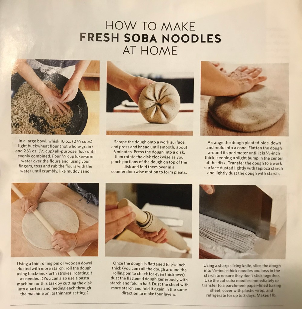
The first example comes from an issue of Saveur, in an article about soba noodles. This graphic seeks to teach you “How to Make Fresh Soba Noodles at Home,” as illustrated in its title.
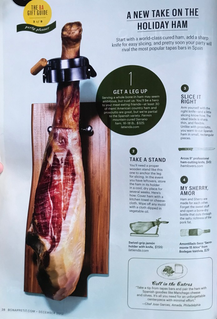
The second example comes from Bon Appétit, illustrating how to set up and consume a leg of jamón Serrano, a Spanish leg of ham.
I will begin by comparing these two examples, as they are each sets of instructions. In my view, given what we have learned, Example #2 is much more effective as information design than Example #1. Both examples employ the use of grids, Example #1 employing a modular grid and Example #2 employing a column grid, as outlined in the Samara reading from week 4. However, Example #1 lacks a clear order and hierarchy, with only three levels of information, and no clear direction for how to read it. As Coates & Ellison explain in our week 4 reading, in information design, one ought to have “decided what needs to be seen and read by your audience and in what sequence.” Example #1 only has a title as an entry point to its set of instructions, and provides no numbers, no subtitles, and no labels. There is not a clear hierarchy or direction for how to begin or in what order to read the instructions.
Example #2, by contrast, establishes a clear hierarchy and sequence by numbering its instructions’ steps and using color. The green circle with the first step immediately commands the reader’s attention and emphasizes its importance over all of the other steps. This example employs the Similarity Gestalt Principle, where the other three steps, in having the same color, size, and value for their number, title, text, and illustration, go together, or are distinctly separate from the first step, so the reader knows clearly that the first step is most important and that the other three carry the same weight, but should be followed in the sequence denoted by their numbers. As a result, this example is much more effective than the first. However, Example #2 is not completely without fault. This page features paragraphs with widths of an average of four words, rather than the ideal seven to ten, as described in the Muller-Brockman Grid Systems reading from week 4. The second level subtitles, i.e. “Take a Stand” and “My Sherry Amor,” feature puns and unclear language, so the reader does not know what the section is about until they are reading the actual text. This is a lack of readability, as explained by Coates & Ellison in our week 4 reading, that sacrifices “meaning or clarity” for the reader. Despite this, I would still say Example #2 comes out more effective than Example #1, as Example #1 suffers from a lack of readability itself, as it features language that would not be easily understandable to an amateur and provides no real entry point to its contents.
My third example comes from another issue of Bon Appétit and seeks to show some examples of drinks for wellness.
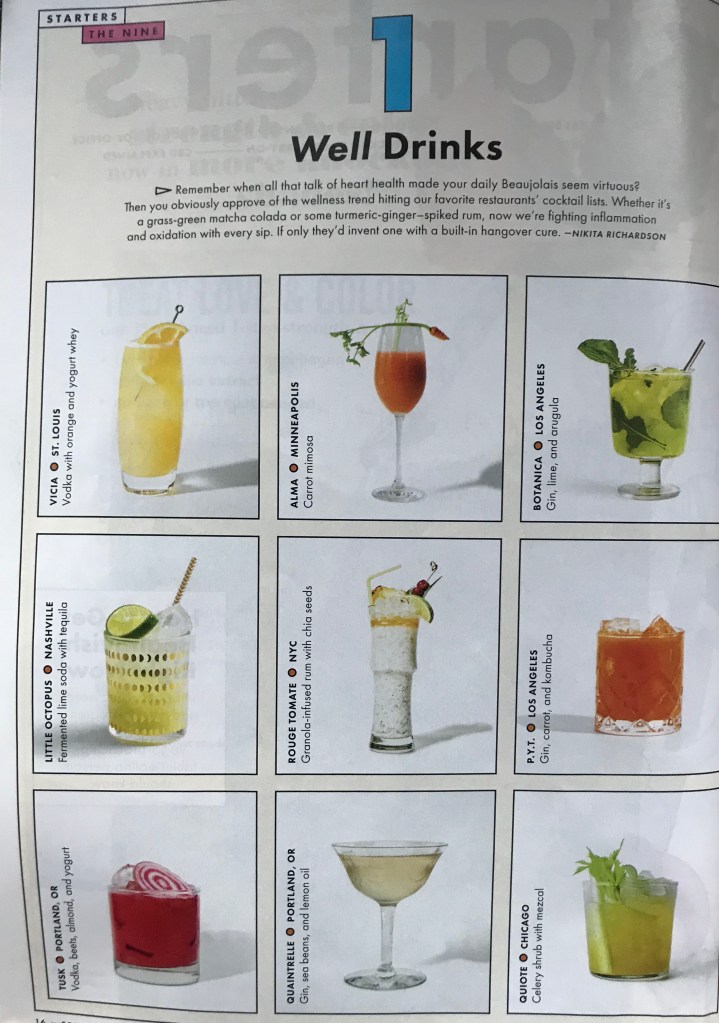
I thought this example was most comparable to Example #1 in the two both using modular grids. This example, however, differs from Example #1 in having multiple levels and a hierarchy of information. Level 1 is the big “1” at the top of the page, using a bright color and larger size to make the audience look at it first. The second level is the “Well Drinks,” the title telling the reader what the page is about. And then within the grid, the pictures of the drinks themselves are most important. Within each square containing the pictures of the drinks, the next level of information in the hierarchy is the restaurant and city/origin for the drink, and then the next level down is then what is in the drink. In discussing drinks that contribute to wellness, I think Example #3 does a fairly good job of quelling any sort of information anxiety, as explained by Wurman in our week 2 reading, by organizing the information in this way, with its hierarchies and levels that are more easily understood. However, despite organizing the information, this example perhaps provides too little information. The large block of text at the top of the page, under “Well Drinks,” is not very readable, and perhaps would have benefitted from being split into two, left-aligned paragraphs as its current width is quite long. But perhaps more importantly, it does not provide enough of a context for why the drinks in the grid are “wellness drinks,” and no explanation is provided for the specific drinks either. Meanwhile, even though the drinks’ information is organized nicely within the grid, it’s orientation is not easily read, either.
Example #3, I would argue, is still more effective than Example #1 in its organization and hierarchies and use of color, but still lacks in readability. This is somewhat similar to my analysis of Example #2. Overall, Example #1 perhaps comes across as the least effective of all of these examples precisely because of its information-anxiety-inducing lack of hierarchy and entry point, and the other two examples, while containing these design elements, are not necessarily perfect, either.
