
Effective Information Design not only facilitates understanding by presenting in an accurate and engaging way, but also supports knowledge transfer. Successful designs are able to show a clear story through visuals that are logically structured and used. I’ve chosen three examples of information design.

The first example is about the key principles in modern marketing and what it does. It is long and very simplistic with its visuals and text. There is a clear grid, in which the alignment of the text and visuals is organized and structured. The top shows a clear definition of the story and information that the design is displaying by providing a brief description of the topic, model marketing. There are well-defined hierarchies with “model marketing” as the clear entry point, where after our eyes are drawn to the first point. Each category of information is numbered, allowing the audience to easily follow the design, and also, the key topic of each category is presented next to the number to establish this second level of hierarchy. Based on the Gestalt Principle of proximity, each category is well-defined, where the information relevant to it is grouped closer together and is spaced out from the other category. Within each section, connected information is grouped together, like the two lines separating the text at the bottom. The visuals are pictographs, images that are abstract enough so that it’s easily identifiable, but not to the point where it requires too much cognitive energy. The colors mesh well together, and besides black and white, only two other colors, red and beige, are used, rather than more colors, which can produce confusion. For some pictographs, the design plays with values of color to emphasize change. Overall, the visuals are mainly informative, rather than decorative, but there are some cases where I feel the pictographs are unnecessary or tend to overcrowd the section. I would say this information design is effective because it presents model marketing in an engaging and easily understandable way. It follows most of the design elements and principles.
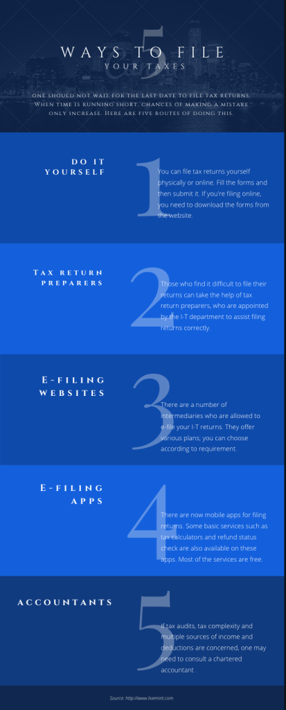
This next example of information design shows the 5 ways an individual can file their taxes. Like the previous example, there is a clear grid with the text aligned. The title indicates the first level of hierarchy, but the large size of the numbers also immediately grabbed my attention. Therefore, although the title most likely serves as the entry point, it is still unclear. The purpose of the design is still understandable, especially since the title of each section is bigger and brighter, which catches the eye easily. However, the white font against the blue background makes the legibility of the text difficult to distinguish among the letters, especially on the lighter blue background. Because the smaller text, which has a lighter typographic weight, overlaps the large numbers, it also messes with the legibility. To separate the sections, values of blue are used, and even though the audience is able to differentiate the sections, the low contrast between these two colors and with the font hinders its effectiveness. This design doesn’t use visual images besides the background at the top, which is more decorative than informative. However, it doesn’t affect the presentation of the information. I don’t think images are needed, but if the text was more complex, then images would be helpful. Overall, I would say this information design is somewhat effective, in that it’s readable and legible while facilitating knowledge, but the design needs improvements in the color scheme and establishment of hierarchy.
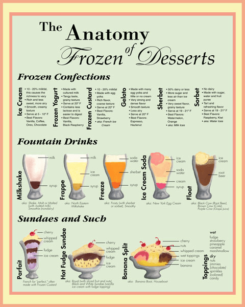
The last example depicts the anatomy of frozen desserts, in which the hierarchy of the title immediately grabs my attention for a clear entry point. A grid is used to divide each section up, where margins between the texts help with alignment. The second level of hierarchy is noted by the bolded words, indicating that there are three categories in this design. The texts are grouped by proximity with the title of the description typed sideways. Although the subcategory title is oriented sideways, I’m still able to see it, but it requires more energy to do so. For the visual images, I believe Gestalt’s Principle of connectedness is used with the lines to show there is a relationship among the elements of the drinks. Color can be an issue in this information design because I know that once more than 2 colors are used, besides black and white, it becomes confusing. The amount of color should be limited, but also to improve, color should be used for identity and kept consistent throughout the images for the same element. For example, each drink may contain a different flavor of syrup, hence the use of different colors, but to indicate the same item, using the same color may help the audience understand the components easier. This reminds me of the design example with the different types of coffee that was shown in the first weeks of class, which proved to be effective because it was consistent with color all throughout. This design uses many typographic families, in which the font of “frozen dessert” may be frowned upon, as its main goal is to be decorative. Overall, this information design example is not as effective as the other two, but it’s still able to somewhat facilitate understanding as it takes longer time for transfer of knowledge. In terms of previous lectures and readings, this example doesn’t seem to follow many of the guidelines, including color, typography, visuals, so I would label this leaning more towards an okay to bad example.
