
For this analysis of information design examples, I chose multiple designs aimed at explaining how to properly wash hands (a very relevant topic right now).
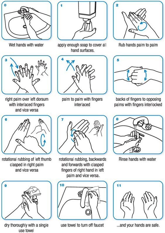
This first example is quite straightforward and highly detailed. As the Roam reading Show and Tell discusses, visuals are a powerful way to communicate information to humans. This poster did a good job of including graphics of the instructions along with the instructions in text format. The colors of the poster work well together. The white background with the blue accent color and the black text is legible to read. The blue accent color was used to indicate the motion of the hands and a distinction between the steps. The use of color is not distracting in any way. The labeling of the step is small but clear. As for the readability of the poster, meaning how easily a reader can understand the text based on the presentation, I think the keywords within the text could have been emphasized, perhaps by being bolded. Another option would be for the poster to title each step to improve upon clarity. Some of the captions for the pictures are short and might not necessarily need a title. However, longer steps like 6 and 7 might have been improved with bolded words or a title for the step because of the length of the caption. Another element the poster is majorly lacking is a title. A title should always be included to quickly communicate the purpose of a poster. Without a title, a designer forces its audience to assume the main topic of the poster user context clues. A designer should never leave their audience to assumptions.
The visual composition of the poster is a stadard square grid. The text is aligned beneath the photo based on the length of the caption. Each module of the grid is about the size of a line of text. As each caption has varying numbers of lines, having the size of the text as the size of the module ensures that there is flexibility in the spacing of the elements on the poster. It allows for each row of steps to be varying distances away based on the caption length and still look organized.
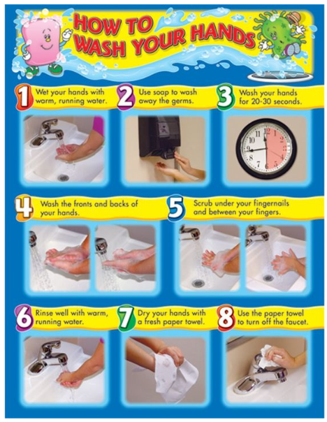
The next example is similar to the first in its use of the grid. It also arranges its elements in the format of rows. These rows seem approximately the same size, even for the title. This is made possible because the caption for each of the steps is the same amount of lines. This poster also chose to use actual photographs for the step explanations rather than drawings. The size of the modules also seems to be the size of the text in this poster.
This poster uses colors and shapes differently from the first. The shapes behind the step numbers are all the same. This demonstrates the Gestalt principle of similarity, which emphasizes that the shapes are all indicators of a step number. Similarity is also shown in the yellow background behind all of the captions. These shapes behind the numbers are 5 different colors. Some of the steps share the same color, which could be a bit confusing considering there is no direct connection between steps 1 and 8 or steps 2 and 6. This poster doesn’t use color as an accent to highlight information but more as a decorative element. Considering the audience seems to be younger (because fo the cartoony graphics by the title), the designer of the poster was probably just trying to make the poster look fun for kids. However, they could have made a fun looking poster without sacrificing the use of color as a communicative tool.
The captions of the steps are short enough that I don’t think they need a title or any extra emphasis on keywords. Emphasis on keywords such as the 20-30 seconds in step 3 could have been bolded to aid in readability. Relative to the size of the images, the text is much smaller. This is also the case for the first poster. This puts more emphasis on the image over the text. I think this was a good move because again, visuals are a powerful tool of communication.
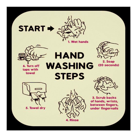
This third example is a different take on the handwashing routine. It organizes the steps of handwashing in a cycle rather than a linear grid. This emphasizes the continual nature of hand washing, which is important for keeping hands clean throughout the day. The cycle would have been better served if the designers used the Gestalt principle of connectedness by including arrows between the steps. This would have emphasized the process of the poster. However, the steps are numbered and the start of the process is labeled, so the audience can still grasp the order of the steps. The designers of the poster could have perhaps put the numbering of the step at a different level fro the caption text, by making the numbers a larger or different font size. This might have made the ordering of the steps more apparent. Because of the different format of the poster the grid is different from that of the first two. The grid could possibly radial rather than a standard square grid.
This example takes advantage of using different typography like the second poster. Similar to the second poster, the title is in bold and a different color from the caption text. This distinction between the text layers was a good typographic decision. Differing from the first two posters, this poster seems to give the text more weight relative to the images (which are drawings like in the first poster). Looking at step 3, the caption takes up approximately the same space as the drawing. As the images are less detailed in the actions of handwashing, the caption for each image becomes more important. This may explain their decision to make the text have more space on the poster. This poster also has fewer steps, so the pictures and text have to work together to communicate more.
The use of color in the poster is interesting. The pale yellow color of the background and purply pink color of the text. These colors are in groups that are across from each other in the color wheel. They don’t necessarily complement each other and almost seem to vibrate because of their strange contrast. If I were redesigning the poster, I would choose a different color scheme.
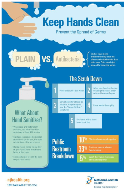
This last poster chose to use a different format. It is more in the style of a traditional infographic by including multiple different types of information, such as of hand sanitizer and public restrooms. The actual steps of the handwashing process are included under the heading of “The Scrub Down”. There is no accompanying images with the steps of washing, which is always helpful in the explanation of a process, as seen in the other posters. The text of the steps are clear, so they communicate the process well, but the picture still would have been helpful. The grid of the poster seems to be similar to that of the first two posters, a square grid with small modules. The poster emphasizes the proximity principle by clearly sectioning off different groups of information within the poster. The text of the poster is quite small, and this decreases the legibility and readability of the poster.
Though this poster has the greatest difference from the other 3, I decided to include it as an example of how designers can choose what information they deem to be relevant based on their focus and audience. Focusing on one topic within a category of information allows you to explore the topic in greater detail while addressing multiple topics gives the audience a breadth of information over depth. A designer has to make this choice at the start of their design process.
Based on how well these posters communicated handwashing, I would say the second was most effective. The use of color emphasized the text and the title. The decorative use of the color in the step numbers is a detractor to its effectiveness. However, I think the first example uses too little color. The text is small, and the steps could have used some emphasis on the keywords. The poster also lacked a title. The third poster’s use of color was not effective. The last poster shows less focus less on handwashing, so it could not be as effective. Effective information design is achieved by using proper focus, organization, color, Gestalt principles, and visual variables like shapes and size. When these elements are used effectively, information can be communicated clearly.
