
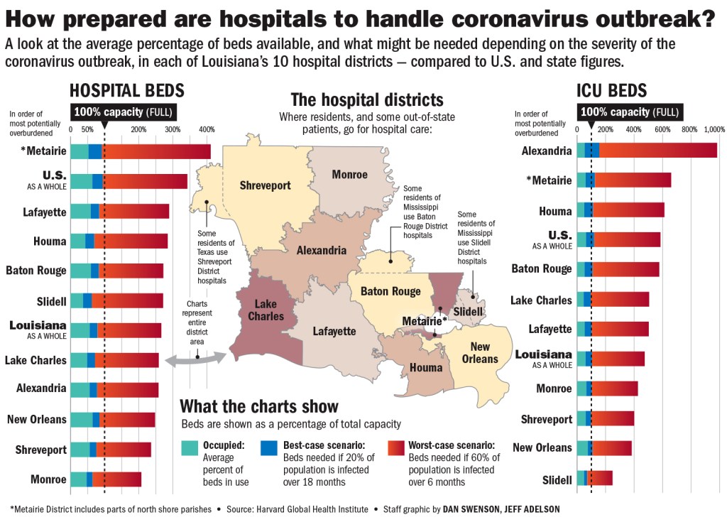
This recent infographic is an effective example of information design. The overall structure is exceedingly clear, and the way that space is used is very balanced. The title is engaging an gives a clear understanding of what the story is about while the subdeck beneath it provides a more specific introduction for what information the viewer can expect. It utilizes the grid in a way that balances the composition and maintains continuity across hospital districts.
The designer uses two distinct groups of color—bright ones like green, blue, orange-red on the sides and muted pastel ones toward the center—for the two kinds of information he is trying to convey. In doing so, he not only demonstrates to the viewer what is important (the number of occupied and available hospital beds but also helps the viewer organize the information even before we have processed it completely.
There are about six different hierarchies.
- 1st level: The bolded title, “How prepared are hospitals to handle coronavirus outbreak?”
- 2nd level: Cap bolded subheadings: “Hospital Beds” “ICU Beds”
- 3rd level: Bolded subheadings: “The Hospital Districts” “What the charts show”
- 4th level: Visual bar graphs with labels for hospital districts
- 5th level: Map of Louisiana with labels for hospital districts
- 6th level: Smaller detail blurbs
This infographic accompanied the following news story: https://www.nola.com/news/coronavirus/article_8a026dec-6bb2-11ea-9aca-e710c51cd60f.html
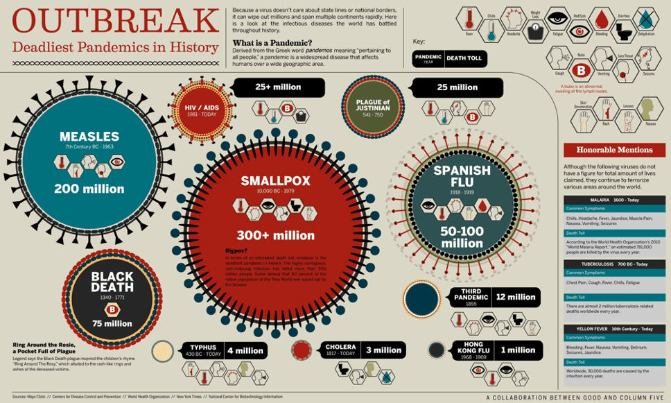
This infographic not as effective as the first. The title gives a somewhat clear an understanding of what to expect though the sub heading right next to it does not provide better clarification—it mentions “several continents” though further mention of it in the entirely of the infographic.
Color variables for the virus balls and for the symptom icons seem to be used in random and spontaneous ways. Most of the virus balls have three or more colors, none of which are used in functional ways. Moreover, three of the virus balls are the same shade of red, and since we are conditioned to associated based on similarity, this design decision begs the question: Are HIV/AIDS, Smallpox, and Cholera somehow related?
Some of the icons for the symbols leave the audience at a complete loss; the icon for bubo, for instance—simply the letter B—does not jog a memory of anything that is recognizable or related to a symptom of an infectious disease. For almost every icon, it’s necessary to check the key in the top right corner for the meaning of the icon.
Design decisions aren’t always consistent. It’s a bit disorienting to have the death toll and symptom icons inside the circle for some and outside for others, leading to an inaccurate and unnecessary key for the black tag, as well as competing hierarchies of information. The death toll tags for 25+ million, which are larger in font and have high black/white contrast, almost draw more attention than the Black Death and its death toll of 75 million.
Categories of information aren’t very clearly distinguished. For the honorable mention disease column on the right, for example. The blocks of symptoms and death toll for each disease aren’t spaced in such a way that makes clear which symptom are for which disease. There is more space between the death toll and common symptoms boxes for tuberculosis than between the tuberculosis and malaria.
Finally the “Bigpox?” description inside of the smallpox virus is quite hard to read due to the color choices that rendered the black words not distinct enough from the red background.
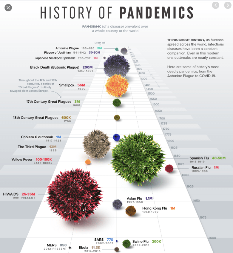
This piece is not as effective as the first but overall more effective than the second.
The drawback of this design comes primarily from the size of the virus ball (which should correspond with the death toll) being confounded by the perspective of the virus balls getting smaller as they move further into the distance. (Although Smallpox killed more than four and a half times the number of people as The Third Plague, they appear the same size in this design due to the aforementioned issue). I think the author is trying to accomplish too much here by utilizing both of these visual variables. A viable solution is to retain the use of size to correspond with death toll but to find another visual variable for the timeline (i.e. place the virus balls on a 2D timeline and start with the more recent at the top.
That being said, the title is quite informative, there is a clear entry point into the piece and direction from most recent pandemic to those further back in time. Other than the previously mentioned issue, design decisions are consistent throughout. There are about five distinct hierarchies (1. Title 2. Virus Illustrations 3. Virus name and Death toll 4. Subtitle and side blurb 5. Details). Like the first infographic, the use of color variable is fairly functional and clear—save for one exception that might throw the viewer off (smallpox) the color of the virus ball corresponds with the color of the death toll.
