

To begin, I’d like to look at this graphic depicting 9 steps for home buying. This is a very long and narrow piece that relies heavily on alignment to be clear and concise. There is an obvious entry point on the ‘title page’ and the flow of the graphic is neatly laid out in a numbered step format. Within each step, the attention goes first to the number of the step, then the title. After that, one is drawn to the smaller descriptive text below, and finally the graphics. The grid is also quite plain, and down the entire graphic, each icon is aligned with the margins and relatively aligned with the others. The colors of the piece revolve around the orange and blue main colors and add in others as well. The graphic is successful in that it clearly defines each step, gives a title for that step, a detailed and helpful description below accompanied by relevant graphics, and most importantly, provides an understanding of the complex topic at hand. The one thing I will mention is that none of the icons add new information to the piece, they in and of themselves are not informative, yet they are a welcome tool for understanding. There is a lot of information coming at you in this graphic, and they help us ground that information with a simple icon and help us separate that information from other important steps. I believe this is more easily digestible and better understood as a graphic rather than as one large piece of writing. Dotted lines within certain steps help to further break down this information. These lines and the information within them suggest that the grid for this piece is quite fine despite its simple visual breakdown. If one were to look at the information design of just one step, it would be much simpler and less fine, but taking the other steps into account mandates a smaller grid.

Next, I brought in another graphic on the same topic to compare. This relies more heavily on the aesthetic aspect of the piece and focuses more on the graphics than the information. The grid is much less fine than the first piece while following the same basic premise: title section, step-by-step instructions accompanied by an icon for association. The colors are somewhat similar, with an orange and light blue base for the graphics. Much like in the first, the graphics are simple, and the color is soft and happy. This could be to make a daunting task seem easier to tackle and more like an exciting and hopeful event. This graphic uses a colored background and lighter foreground to emphasize the areas of information. The flow of attention is exactly the same as in the first graphic, too. The second graphic, however, provides far less information with a mere sentence or two for each step. It jumps right in to boosting one’s credit score without mention of buying a house or why this is important to the process. Instead of flowing from one step to another, each feels like a truncated and entirely different topic. I would consider this a visually pleasing yet ultimately unhelpful for the topic at hand. The artist went for simplicity and ‘cuteness’ over information, so while it provides some helpful, unanchored tips, it does not give someone a better overall understanding of the process.
Lastly, I want to bring up this graphic.
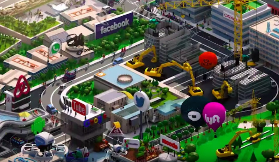
I realize that this is not the standard format of information design. It is a screen clip of the intro sequence to the HBO show ‘Silicon Valley.’ It depicts current events in the world of technology, and I would argue that it is information design. The main goal of these graphics is to inform the viewer about real-world goings-on. The emergence of a new company shown being built with construction equipment, the acquisition of one company by another shown by them moving into the same space, or a battle between two companies for market capitalization shown, for example, by the Uber and Lyft balloons fighting for airspace. I genuinely believe that this is an example of a seriously unorthodox style of information design. Though diagonal, the grid is very much there, and the information in the graphic abides by this grid. The color scheme uses neutral colors and greenery in the background to have the logos in the foreground really pop. Do I think this is effective? Yes, I do. Especially when one sees it in motion, it does a far better job of giving the viewer information and understanding of the technology world and its players than a written explanation could provide in 15 seconds. It is a lot of visual stimuli to engage with, but our brains are able to process it quite well. What I think it does not do well is that there is no clear entry point, the colors are too bright and distracting from the information, and that the use of 3 dimensional icons is visually to complex. I think that this is a unique and interesting way to look at the world of technology, and that it actually does a fairly good job of presenting the viewer with absorbable information.
