
Main story:
The articles I chose discussed new findings about butterfly wing structures on the nanoscale, and how these structures can inspire engineers to create efficient materials that can help with global warming. I mainly tried to explain why butterfly wings are thermally efficient (because of the structure and thickness), and then tried to relate this to how the structure can be applied to create roof structures that radiate heat efficiently.
Core concepts:
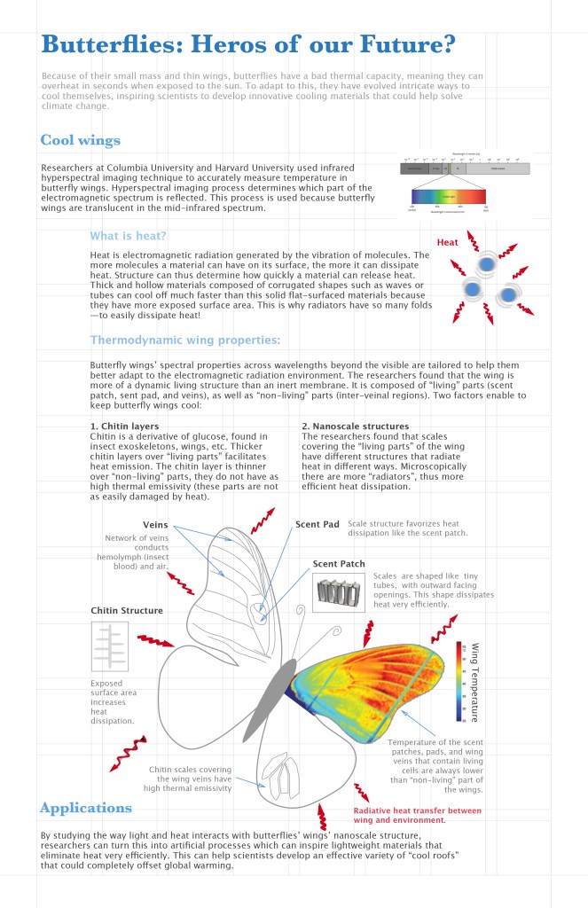
Because the articles were so science intense, I really had to pick and choose what I wanted to include or what I thought was most important from the articles. I decided to divide the poster into two main sections, “Cool wings” and “Applications”. The first section has two subsections, one explaining what heat is and the other explaining how heat works in relation to butterfly wings. To explain what heat is, I tried using a visual of vibrating molecules, but I mostly used text for this section because I did not know if the graphic part would be enough to explain. I struggled a lot with transforming text into visuals for the entirety of the poster, mostly because I had no idea how to do a rainbow color gradient to represent thermal properties (I tried researching it but could not find a way to do it) and the nanoscale structures in the wing are 3 dimensional and I had no idea how to do that either (again, I tried many ways to try and do this graphically to no avail). Thus I used some (edited) graphics from the articles since I do not yet know how to represent these efficiently. I wanted the main part of the poster to be the butterfly (it draws the eye in because of the color), but I felt like there was too much to be put before the butterfly graphic and thus it did not end up in the middle. I also struggled to make the butterfly look nice, so for now it looks too simplified. I don’t know if rearranging the text around a central butterfly graphic would be more or less confusing, but in my next draft I plan on working towards less text and more visuals and finding ways to relate everything to the butterfly graphic.
Informational organization:
Since this is a very scientific poster, I wanted to have a clear linear story line, where the viewer reads from the top of the page to the bottom. I used the blue color for the title sections, and as the levels go down I decreased opacity/made the blue lighter. I used the blue because it refers to “cool” which relates to the story, but the rest of the text I used black/grey because I wanted to reserve the colors for the graphics. The main way I differentiated the titles in the different levels was with font color, but also font size and distinguishing serif/sans serif. For the meat of the story, I indented the text to further indicate the level. I had clear grid that I had on the background of the poster to lay everything out, and even though I tried placing everything using the grid the organization still looks off.
For the graphics, since the science discussed relies on thermal properties of butterfly wings, the best way to illustrate this was by using color. For the main butterfly graphic, I tried using the different sections of the wings to illustrate different concepts (ie on the left was the wing anatomy, on the right the thermal properties illustrated). I tried distinguishing text related to this graphic by using a lighter grey and a smaller font.
There are definitely things to be improved for the graphics, mostly figuring out how to do the rainbow gradient and creating 3D drawings. I want the butterfly to be the main part of the poster, where everything can be understood from that, but I don’t know how I can achieve that. In its current state, the poster definitely looks off, maybe because of the indentation in the middle section, or perhaps there is too much text? I know the application part is also way too small if I want to make it a main section, but I have to first determine if the overall story is understandable or if I have to add/subtract elements. Then I plan on refining the graphics and turning more text to graphics.

I really like your design so far. You’ve done a great job at organizing all of the information and not overwhelming the reader. While I agree that more visuals are typically the norm, you did a great job of making this infographic visually appealing despite the amount of information you packed into it. I think the thermal analysis image you incorporated in your poster looks great. It gets the message across and doesn’t take up too much space. By allowing the rest of the butterfly to not include the thermal analysis you are able to clear up some space for the reader. Maybe this is why you didn’t need too many graphics to get your message across, the butterfly image provides a lot of information in various layers. I think there is a little bit of color missing in the poster but your overall hierarchy is well thought out. The layout of the poster also might be better off being horizontal. Great job so far though!!!
LikeLike