

The three examples of information design that I chose are design products that I have come across personally even before starting this design class and paying attention to the academic aspects of information design principles. These examples resonated with me as they were the first ones that arose in my mind upon reading the prompt in executing a comparative analysis of effective and ineffective uses of design principles. The first two are illustrations of information design on the theme of nutrition and health that I believe are an exemplary and effective implementation of design concepts and foundations; the third example is one that I consider to be a failure based on the principles discussed in the class readings and lectures as well as an instinct for aesthetic preferences and information retention.
The first example comes from my most often used app, “Zero,” which is a timer for intermittent fasting. Intermittent fasting is a somewhat complex structure of eating and it is often hard to calculate the required period of time to reach the health benefits of it. However, this application serves as incredibly useful in automatically calculating and conveying the progress. The dashboard, in its balanced grid layout, utilizes a visual composition with a clearly focused entry point that relies on the largest object being the centered circle timer. As it is the most important piece of information given the purpose of the application, the focus visual composition is an effective choice that was implemented in this dashboard structure. Moving away from the largest in size object at the center, towards the bottom of the dashboard, there is secondary information that is much smaller in size yet still very clear and important to the integrity of the application and its purpose such as the option to end the fast, report the feelings about the past, and to review the history of fasting progress. Additionally, the color scheme of the app contributes to its high level of legibility in order to distinguish the characters and the individual parts. The black background and the white and warm pastel orange shades are harmonious and pleasing to the eye ultimately aiding in legibility due to the high contrast environment. The information is also carefully curated to provide only the relevant details such as when the fast started and when it must end to the exact minute in order to ensure an accurate progress of intermittent fasting. The clear organization completes the parameters of a focused entry point, information hierarchy based on the size of the information elements and a balanced alignment that fills the imaginary grid in while still leaving necessary empty space to establish the margins and not overwhelm the user with information whilst fasting. As a result, this dashboard serves as a very beneficial tool to help users navigate the process of intermittent fasting and successful retrieval to complete the task.
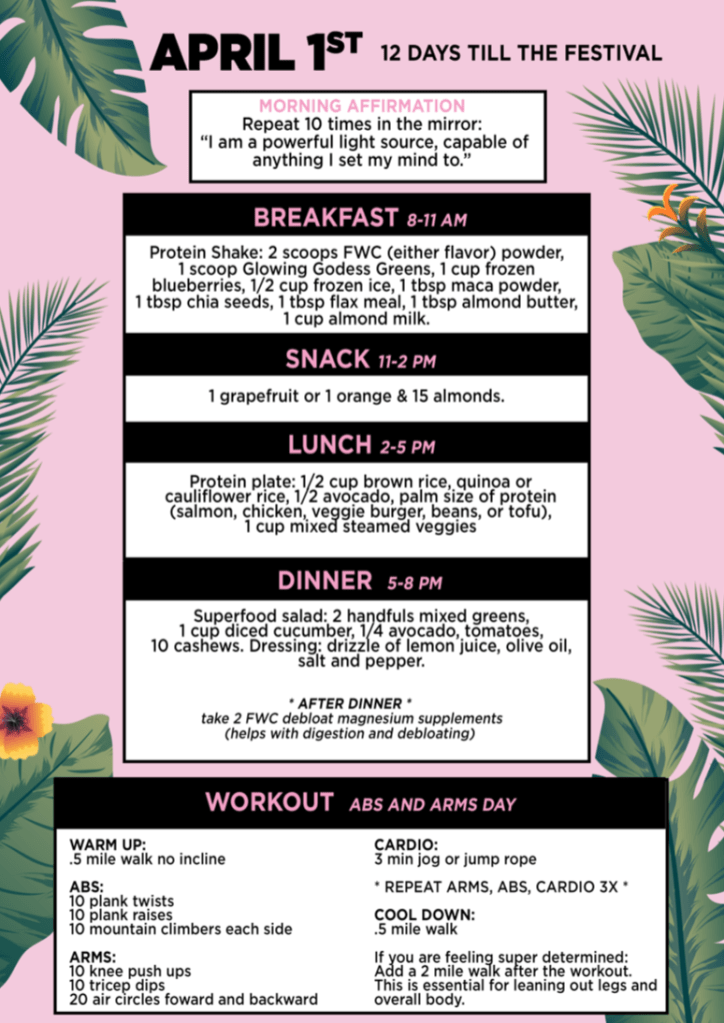
The second example comes from my favorite nutrition detox plan from FitWithCambrie. This image is from a day of detox instructions that includes detailed foods, workout, and mindset to implement into the lifestyle. As a piece of information design, this graphic utilizes a grid that helps organize the visual components in the symmetric and balanced hierarchical structure. The elements are centered from the middle of the page downwards as to establish a reading flow in chronological order of meal consumption based on time of day. The categorization of the meals from breakfast to dinner establishes a logical reading flow most effectively emphasized through the directional cues of the placement of elements on the page with clearly outlined headlines based on the priority of content. The larger, darker and heavier headlines above each meal contextualize the time period and type of meal within the day. Following the categories of breakfast, snack, lunch, or dinner is the secondary information of detailed allowed foods during the detox that is represented by smaller font size, lower position, lighter colors and weight of font with a center-aligned paragraph alignment as to parallel the entire structure of the page flow with the centered boxes down the page, thus keeping the style cohesive throughout. The bottom of the page includes a workout section that is stylistically identical to the meal plan yet distinct in the content of the information provided. Both the workout section and the meals section are characteristic of high readability and legibility given the font from the Sans-Serif font family, high contrast color scheme combination of pink, black and white, as well as the categorization of information that makes the graphic easy to understand and distinguish all the characters and individual parts of information. The margins on the side of the main information are primarily present for a decorative and aesthetic purpose. As we discussed in class, the decorative component is at times risky and must only be done with purpose and intention. While the visual variables must be used as information and not as decoration, in the case of this meal plan, the greenery of plants is not distracting but adds a pleasing element, which is also thematic with this detox as it has imagery associated with summer and tropics, and the context of this 12-day detox is to look and feel the best for the Coachella summer festival.
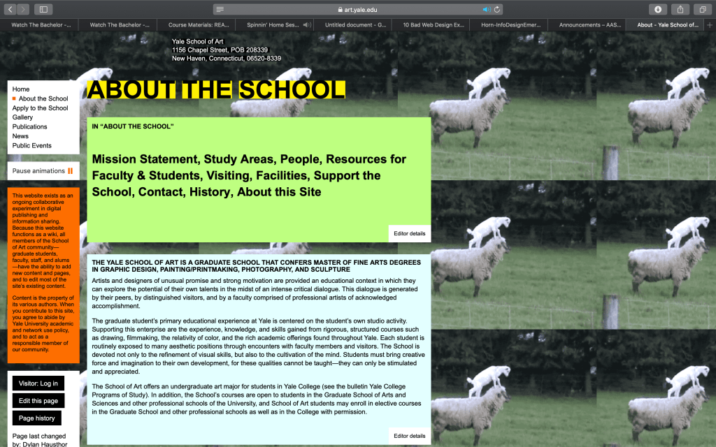
The third example comes from a website that I stumbled across at the time of researching schools and their programs before applying to colleges. The art department was important for me to familiarize myself with when coming to a decision of the schools that I was going to apply to and which ones I would prioritize. Unfortunately, Yale fell off my priority list of schools early on and partly due to this unprofessional and poorly designed website that failed to provide the information that I desired about the Yale School of Art programs to undergraduate students. The message delivered by this information design was compromised by the lack of structure given the randomized and unclear hierarchical structure. The background is severely distracting and irrelevant as the repetitive pictures of sheep detract from the information about the school. The gravest mistake of this information design is the color scheme that is grievously haphazard. The colors of black, white, yellow, orange, blue, and various shades of green are all enacted on the page. For example, the title “ABOUT THE SCHOOL” on its own implements the needed contrast with the black and yellow, however, ends up futile because it falls against the backdrop of the goats’ pictures that create an unsettling visual effect with the mixing of colors and shapes. The left vertical box in bright orange is exemplary of a poor contrast as the black is not easy to read against that toxic shade of orange, and furthermore it disrupts the flow of information as the noxious orange color jumps out and captures the immediate attention without following the logical order that the information should be received and presented in. Even though the typographic fonts, weights, and styles are fitting and clear, that quality is ultimately lost due to the lack of consideration for a harmonious color scheme and vibrating saturation combinations. The information is categorized in a sporadic manner due to the individual boxes that are stylistically different from the rest, leaving one with no sense nor understanding of cohesion and which elements are primary, secondary, tertiary and so on. While the content of the website and the information that is written on the website is overall helpful and useful, the implementation of the information design is poorly executed with no stylistic theme. Gravely, the page layout is unstable with the spacing issues of all the information pieces skewed to the left, leaving the right side of the page empty and featuring a repetitive pattern of a sheep imagery that diffracts the attention and focus of the website’s purpose. Overall, the website was hard to navigate and did not support knowledge transfer through interaction with it. It did not communicate nor teach about the program, mission nor values of the Yale Art School program in an efficient nor effective manner, thus resonated with an example of inappropriate use of visual language because of the previously outlined components that do not connect the audience with the topic of the website, do not promote understanding nor hold the attention to a logical hierarchy of information presented.
